
This is the third project of a series of UX projects from the Treehouse UX program. In this project, I designed a website called Wooshmail that allows users to create email marketing campaigns, browse through available email templates, and analyze the performance of their campaigns. I needed to design it in a way that was user-friendly and intuitive enough for beginners, but powerful enough for advanced users.
Role: Research, strategy, design
Team: Solo project
Length: May to June 2020
Tools: Adobe XD, Illustrator, After Effects
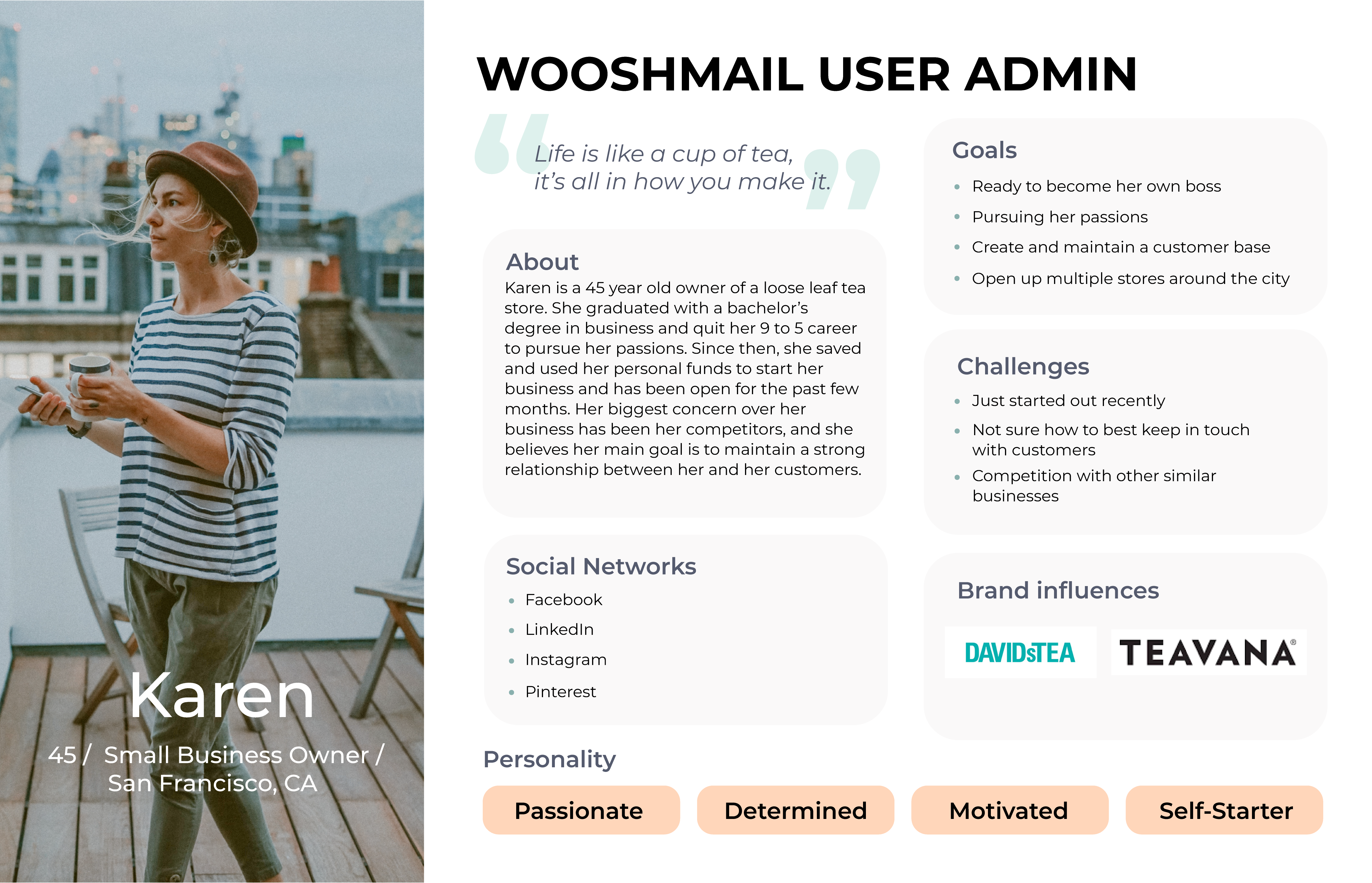
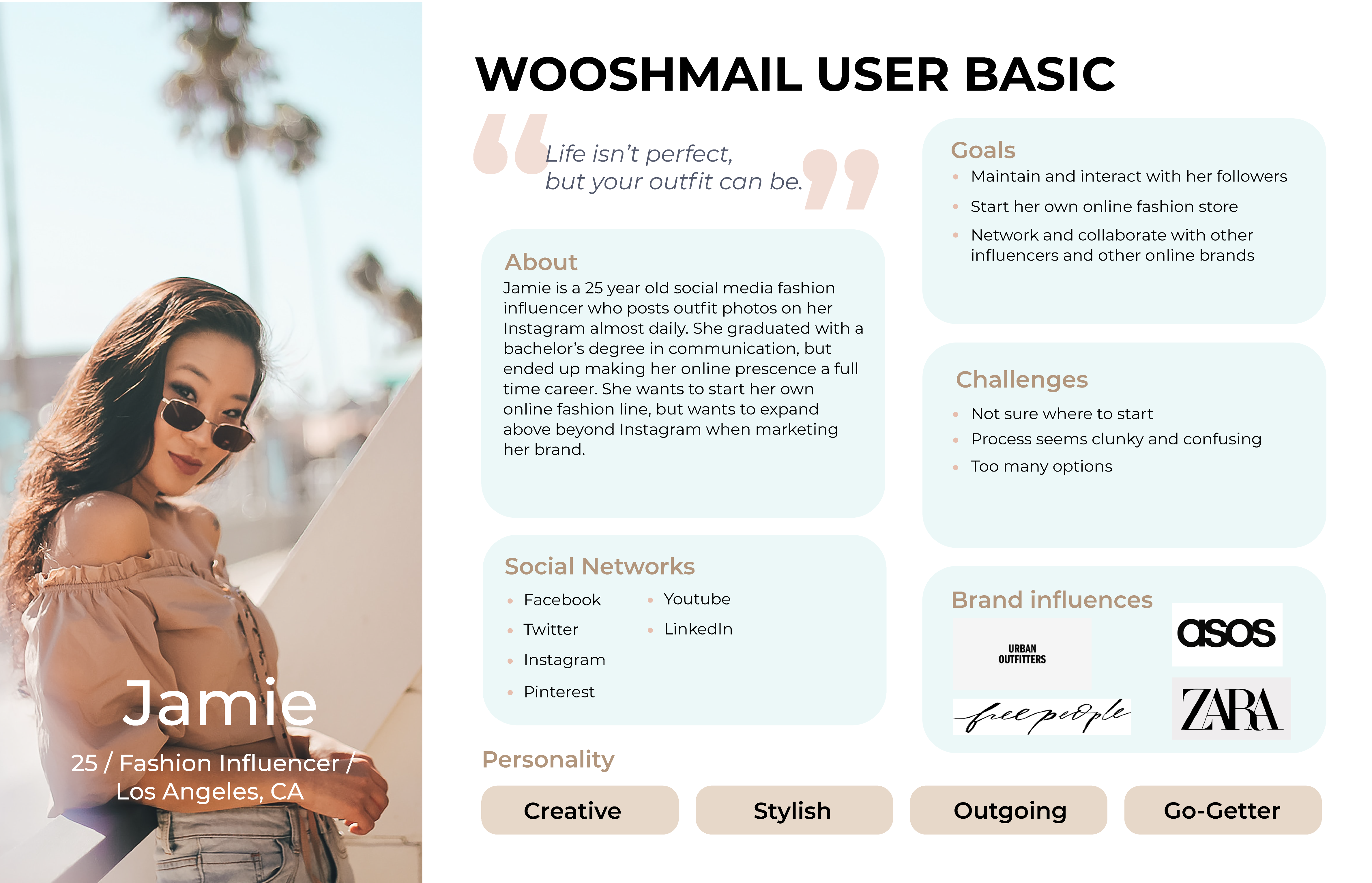
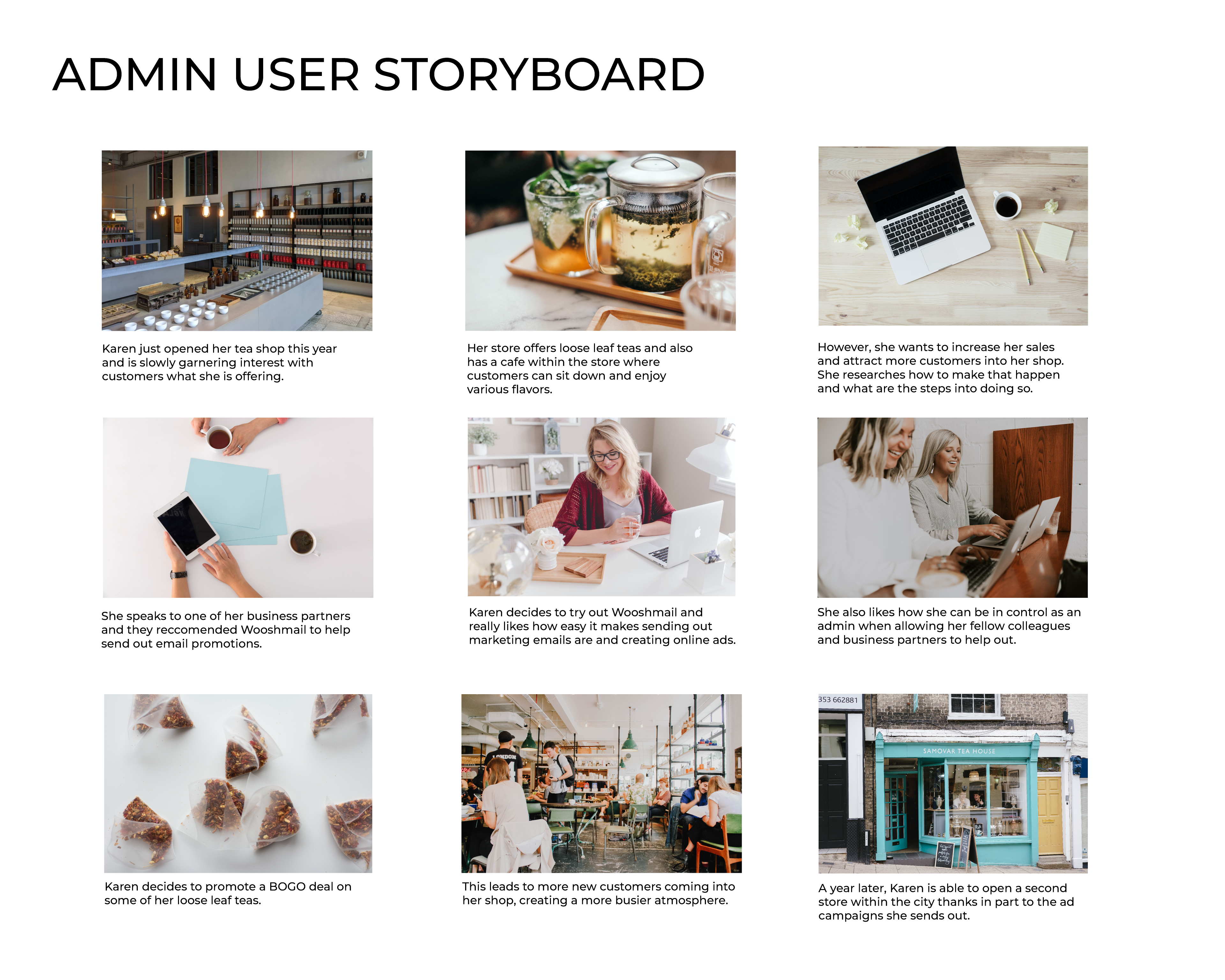
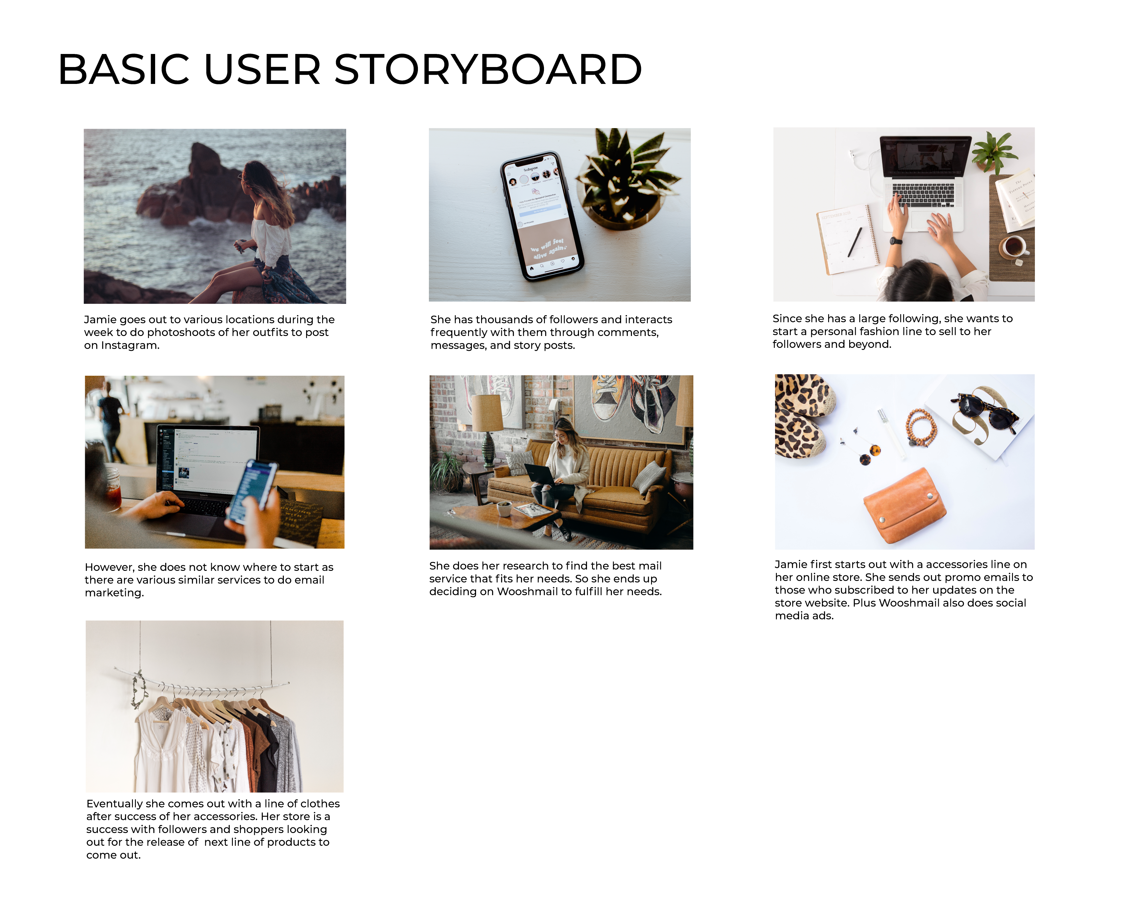
Wooshmail is a mock email marketing campaign website that needed two user flows, “Admin” and “Basic” roles. The Admin role is for business owners and advanced users who manage the entire email marketing for their business, and make the final calls. Basic users have a more restricted set of features available to them, and need their work to be reviewed by Admin users. They are looking to create and improve the experience for both flows, as their audience consists of mostly small business owners and entrepreneurs.
Most small business owners want an easy way to keep in contact with their customer base. The common issue is that the process can be clunky and confusing, as many tend to be older and are not very tech-savvy. The issue becomes more compounded as they try to use complicated editing tools, understand niche marketing phrases, or even try to navigate these sites.
One other issue is also that there are various existing competitor sites such as Mailchimp, Mailerlite, and Constant Contact - all of which have a similar set of features. This makes it difficult for prospective users to decide which service to use, since they all seem to be the same.
I sought to answer the question: How can we make a email campaign site straightforward enough for any small business owner to use?
At first, I looked into understanding not only the issues that small business owners face, but also what the product itself is. I started by:
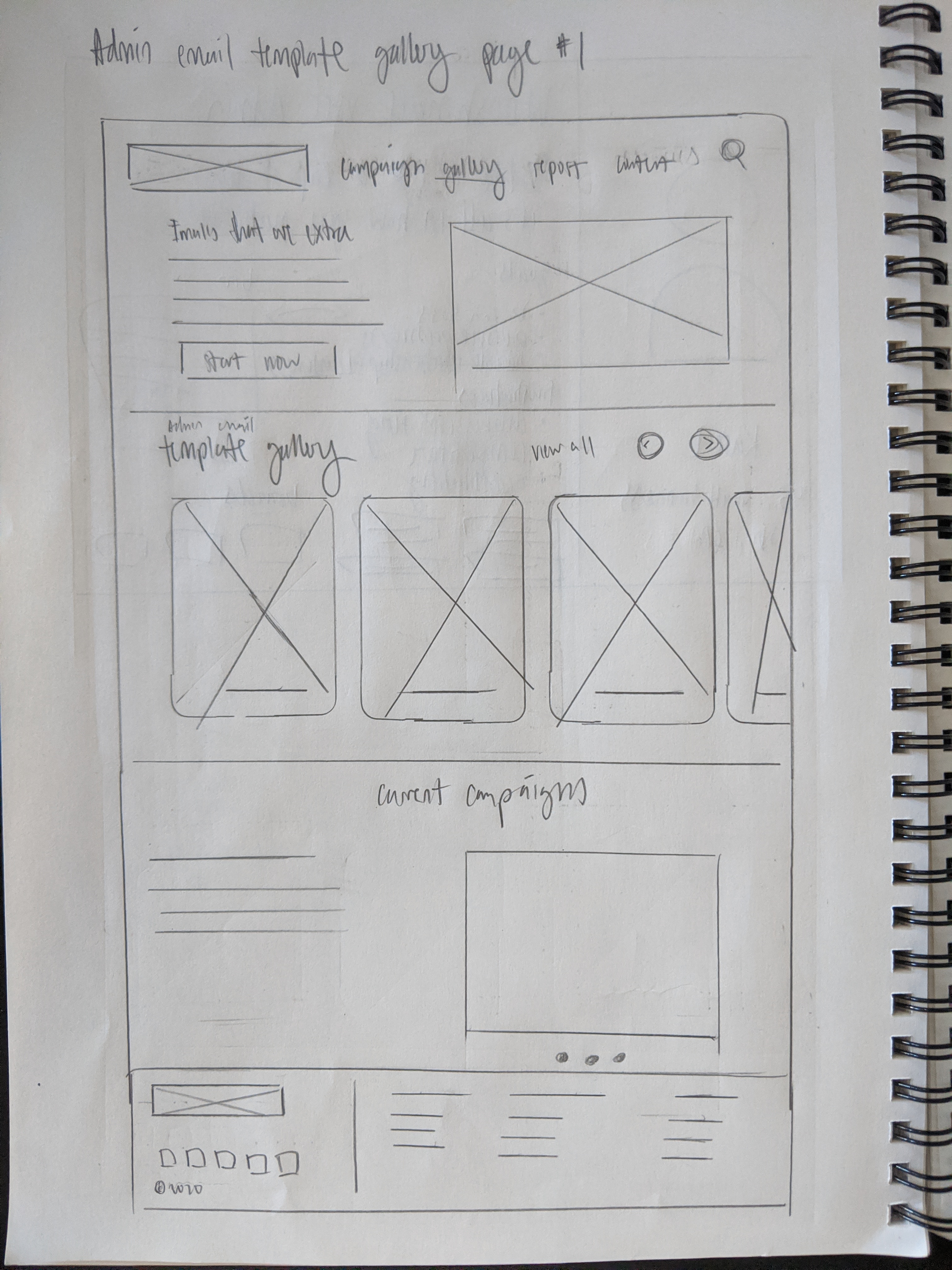
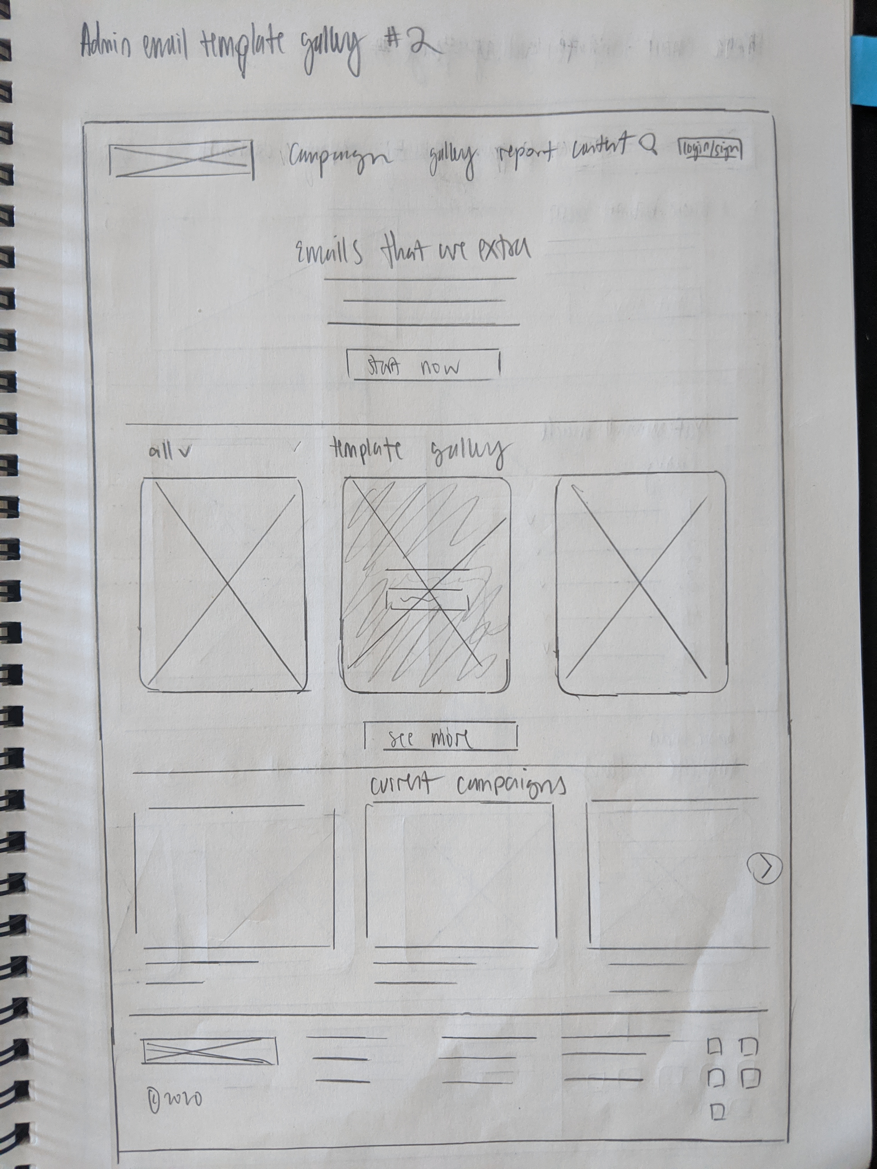
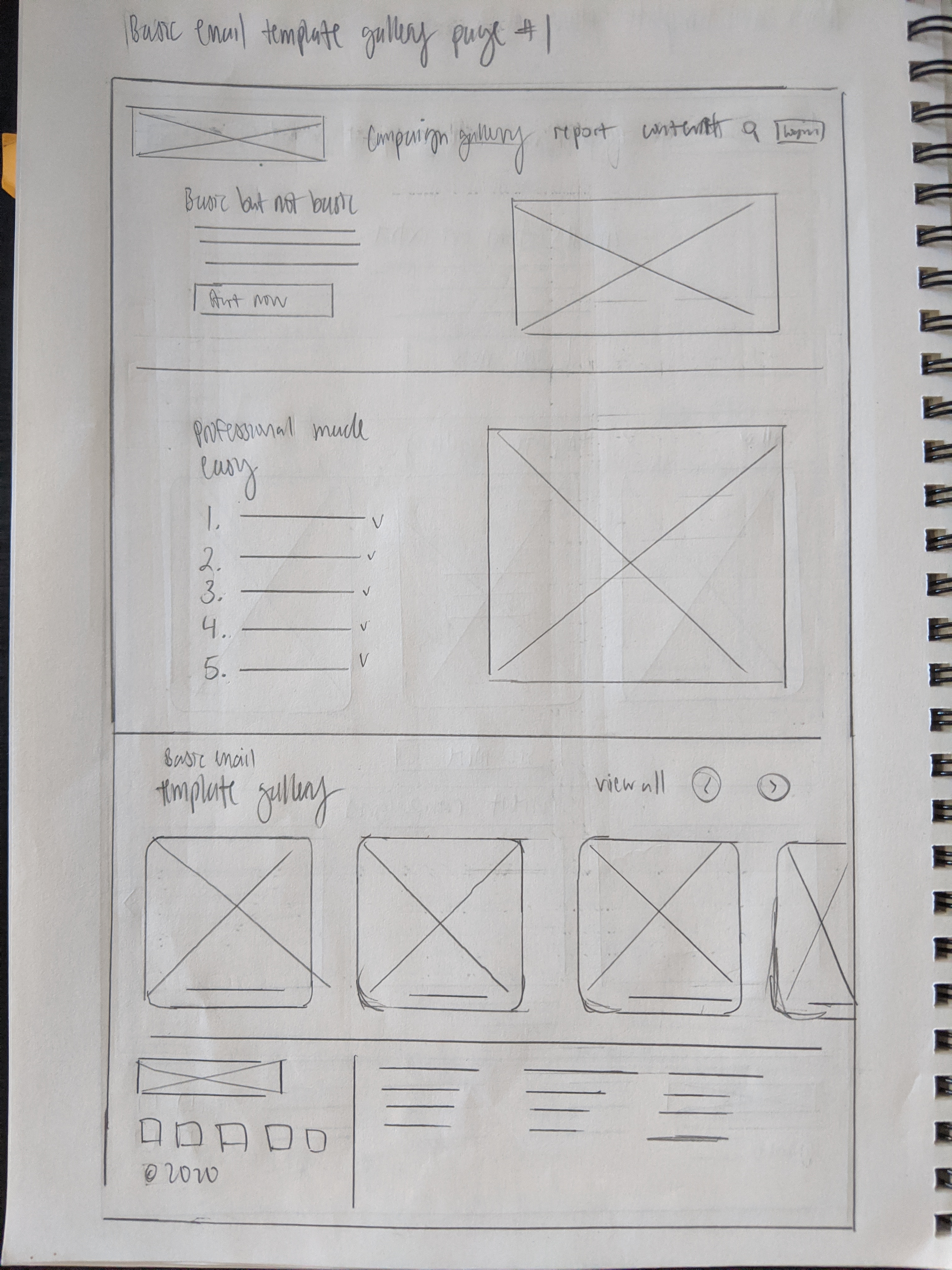
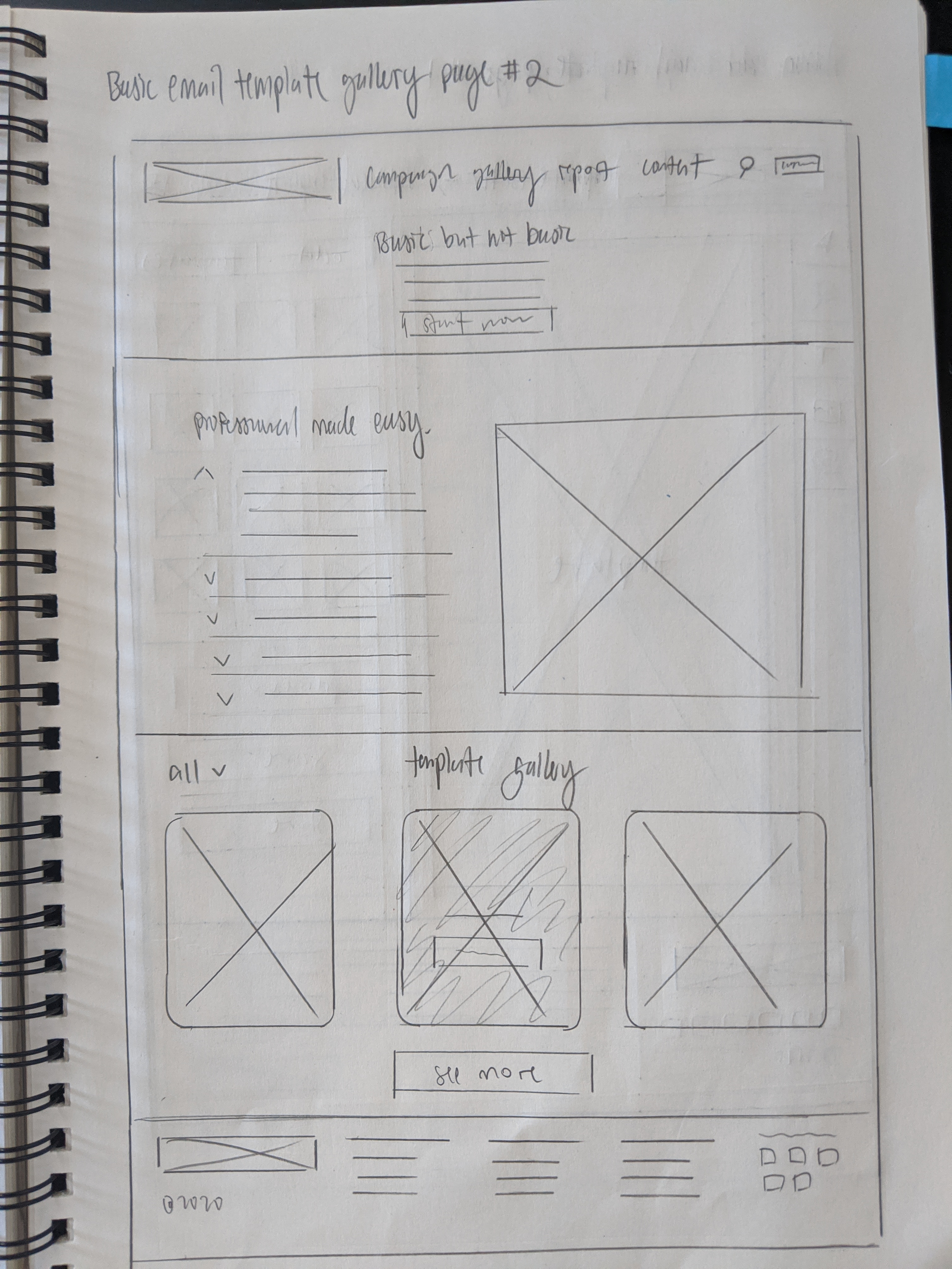
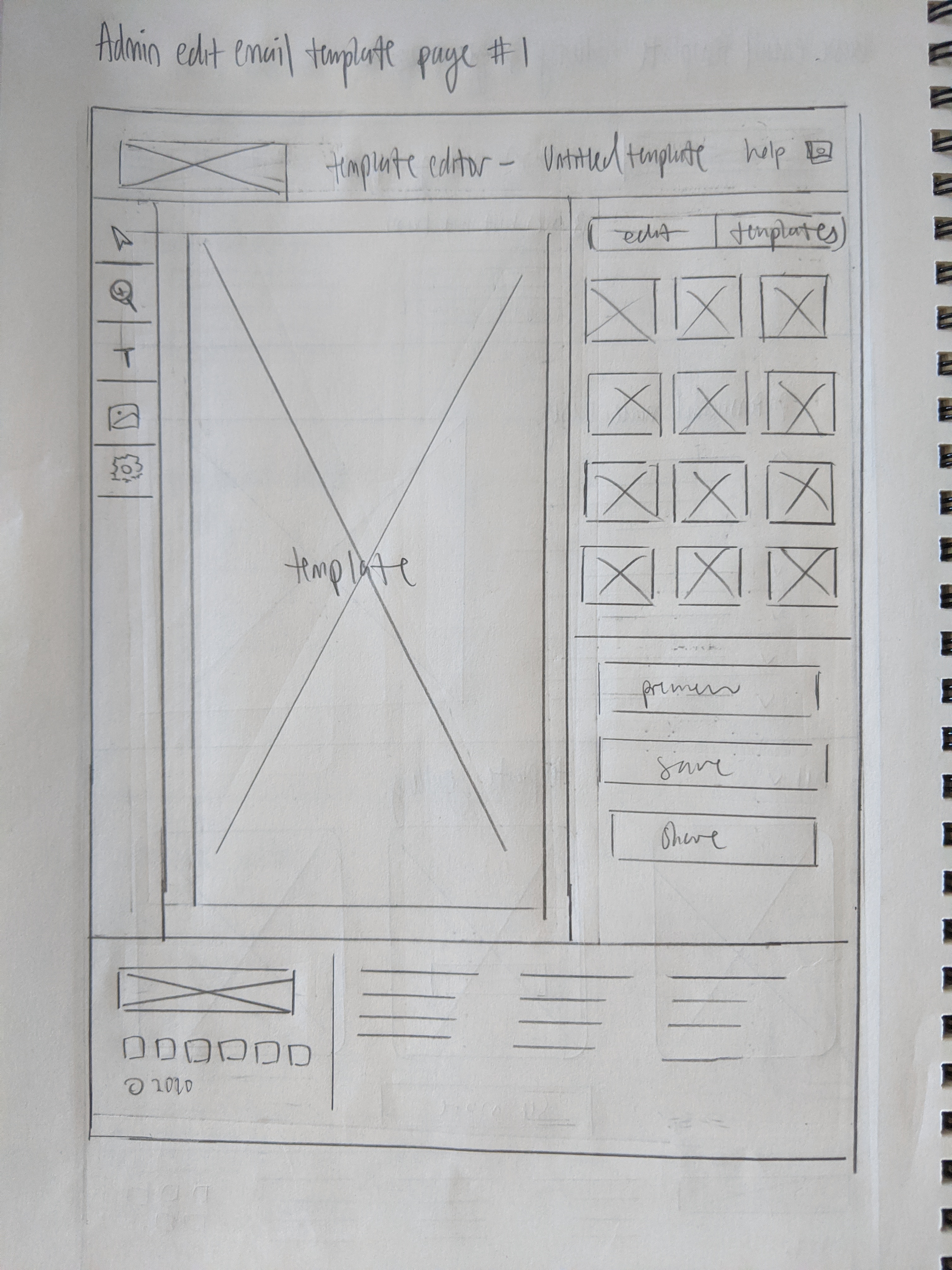
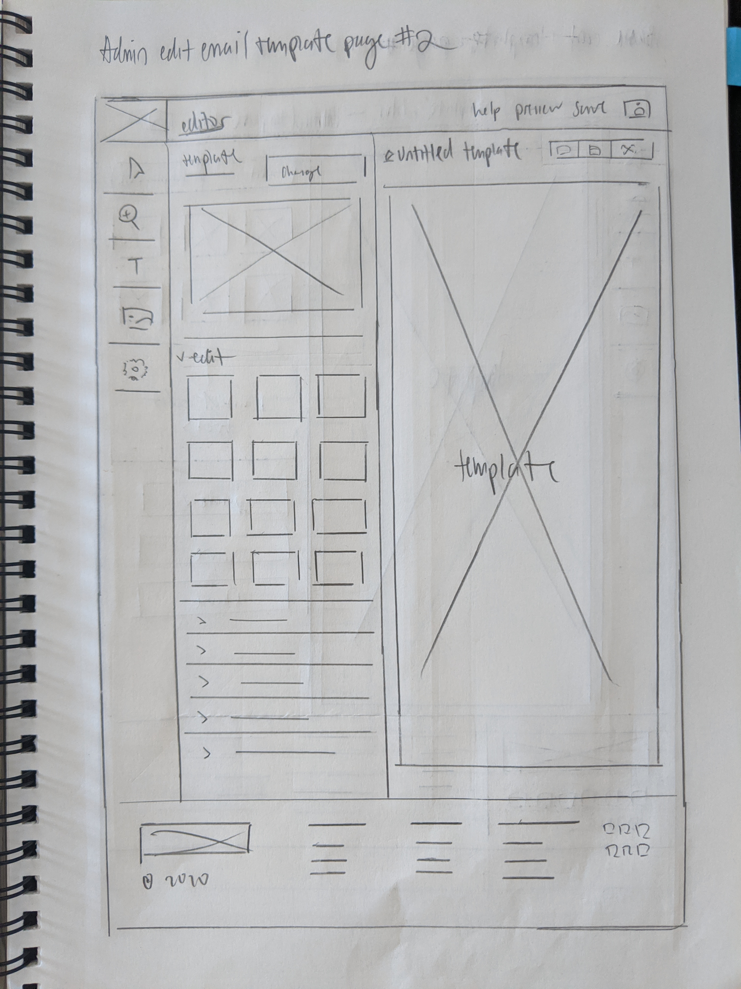
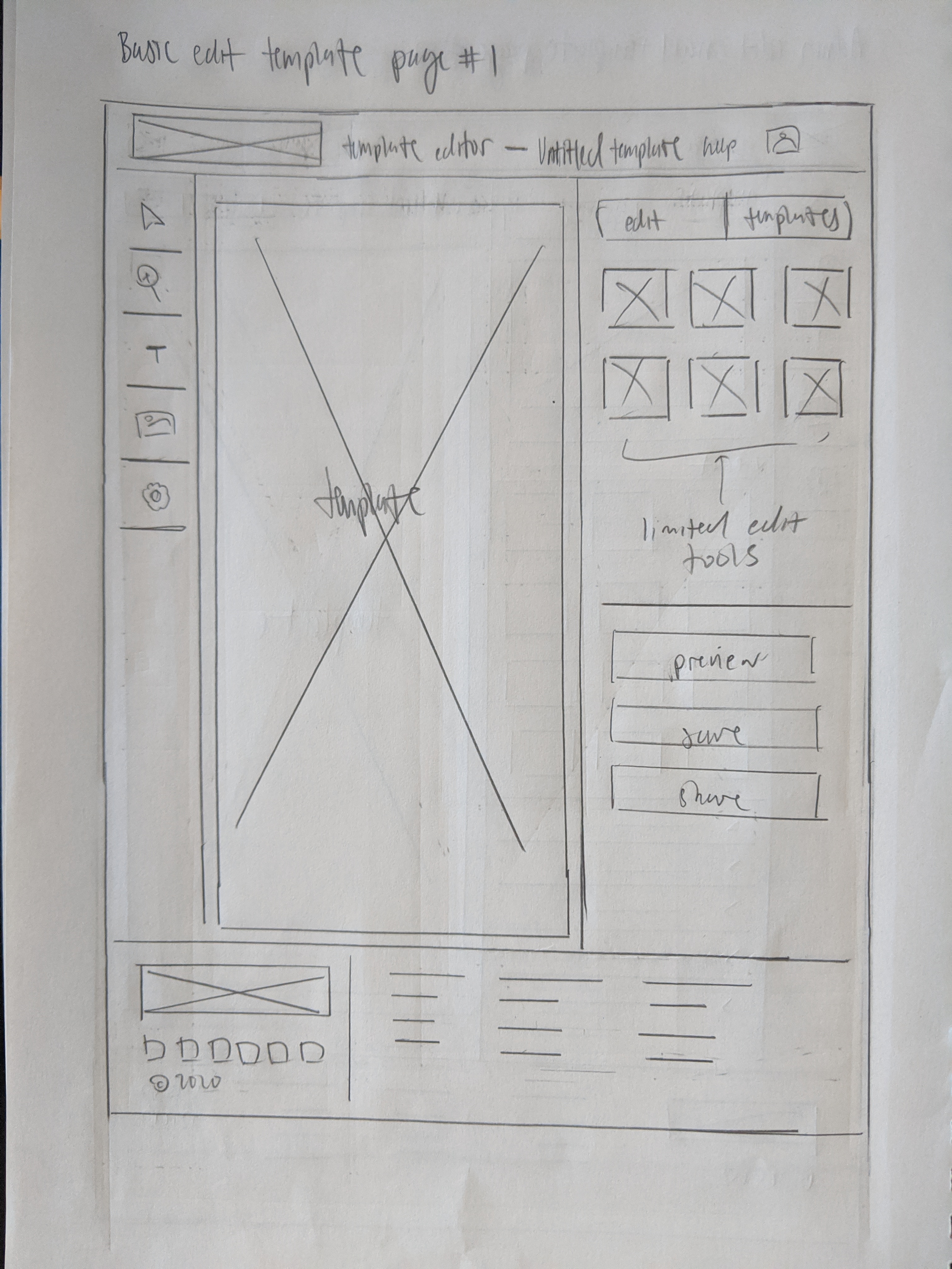
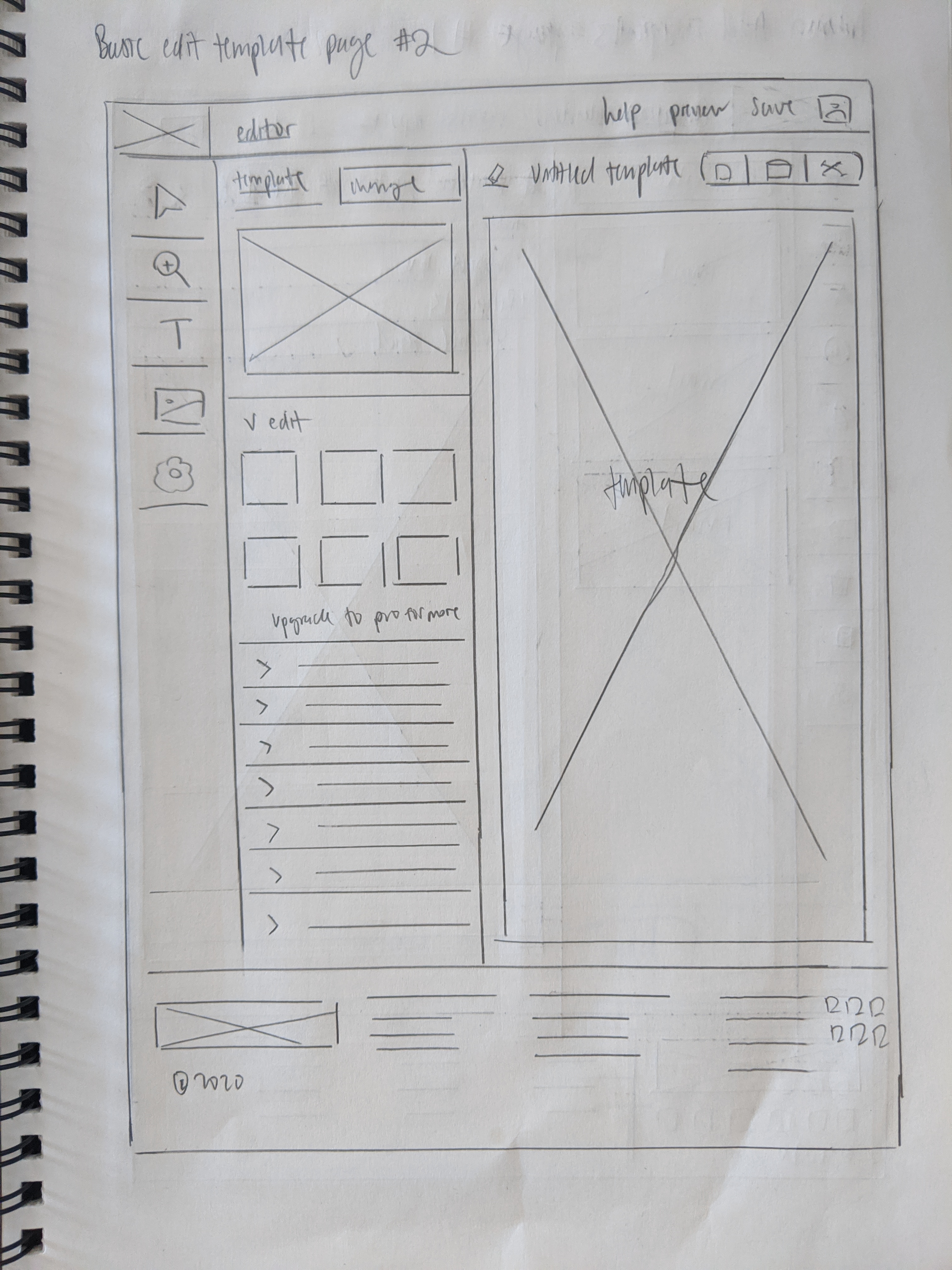
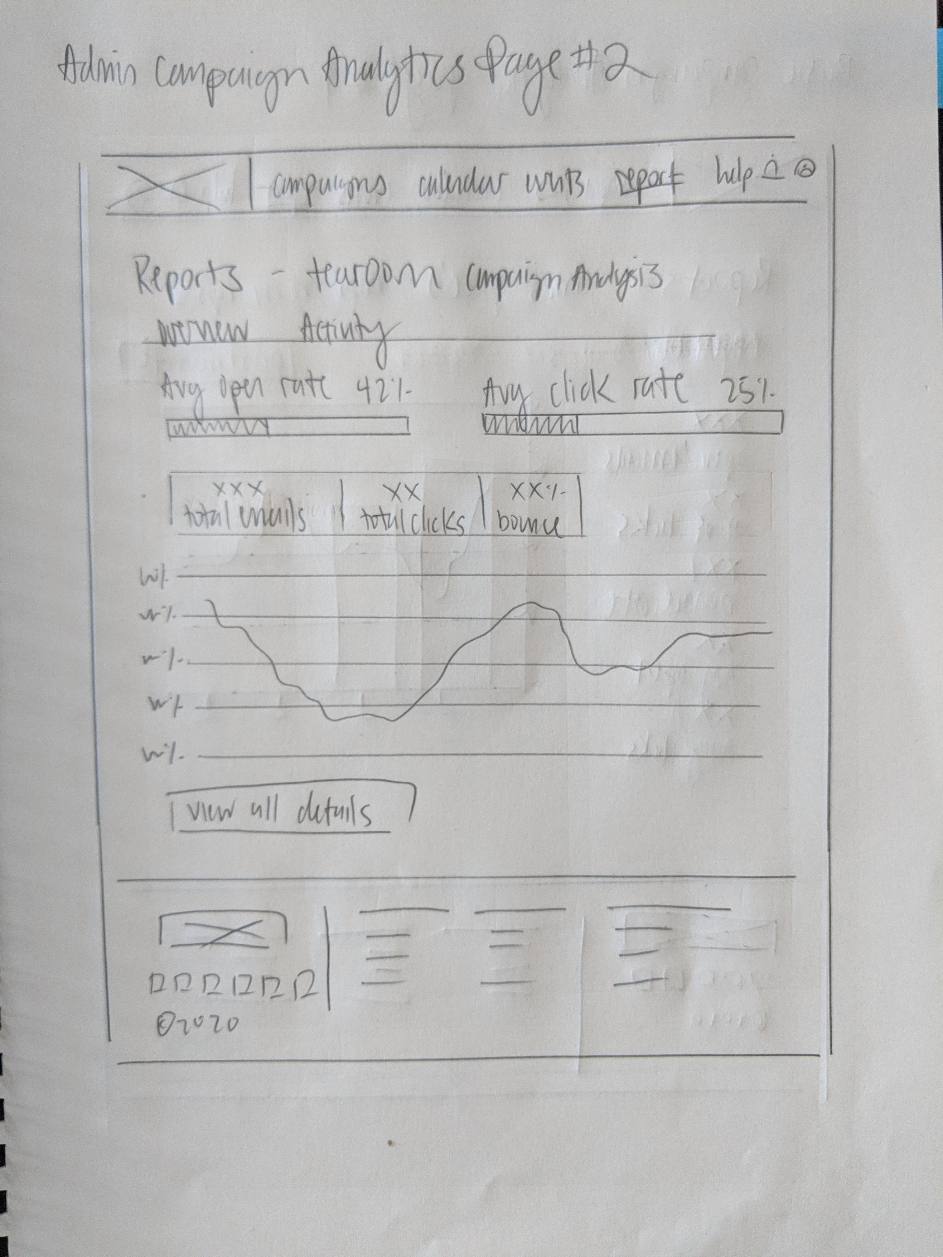
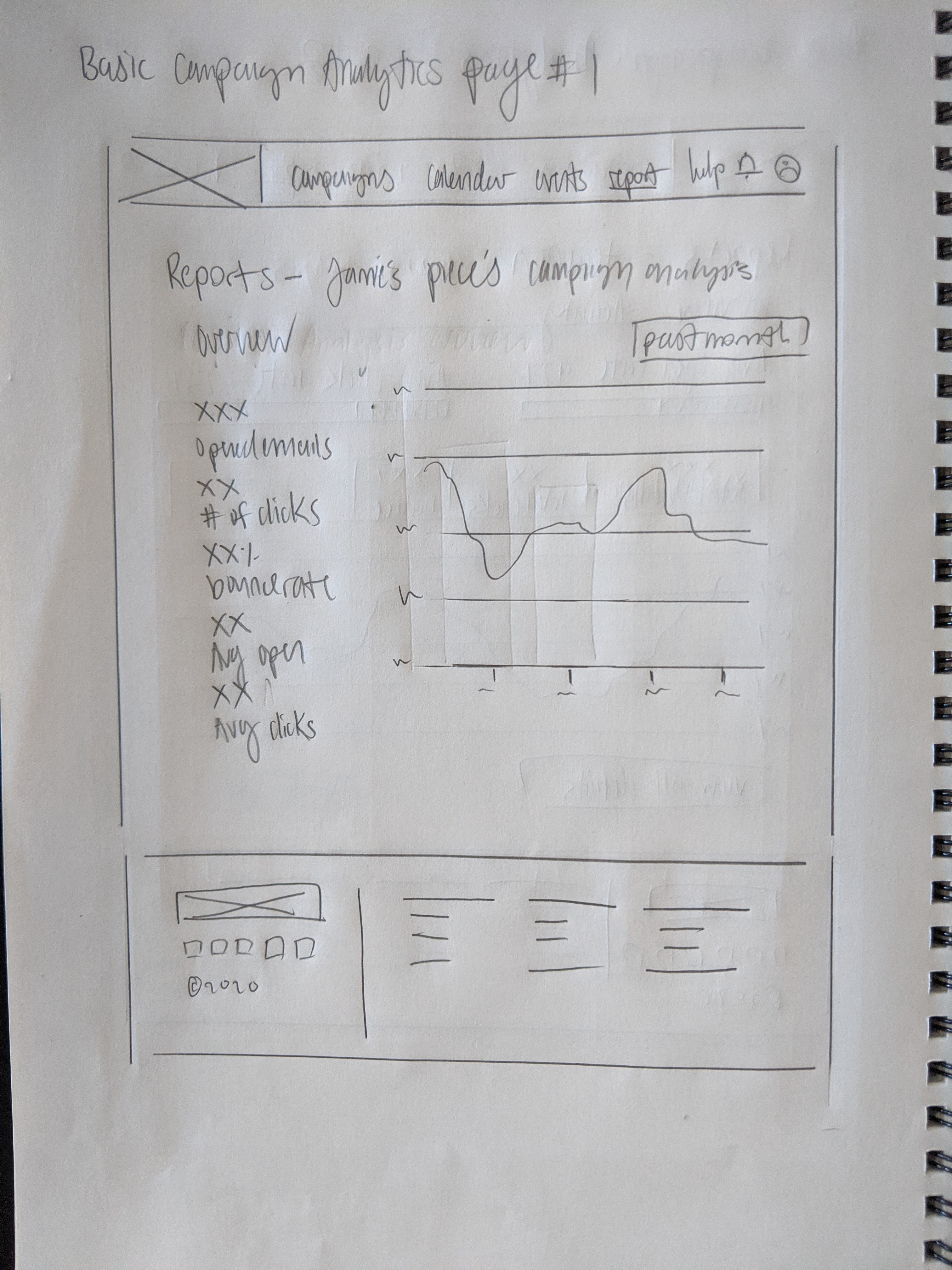
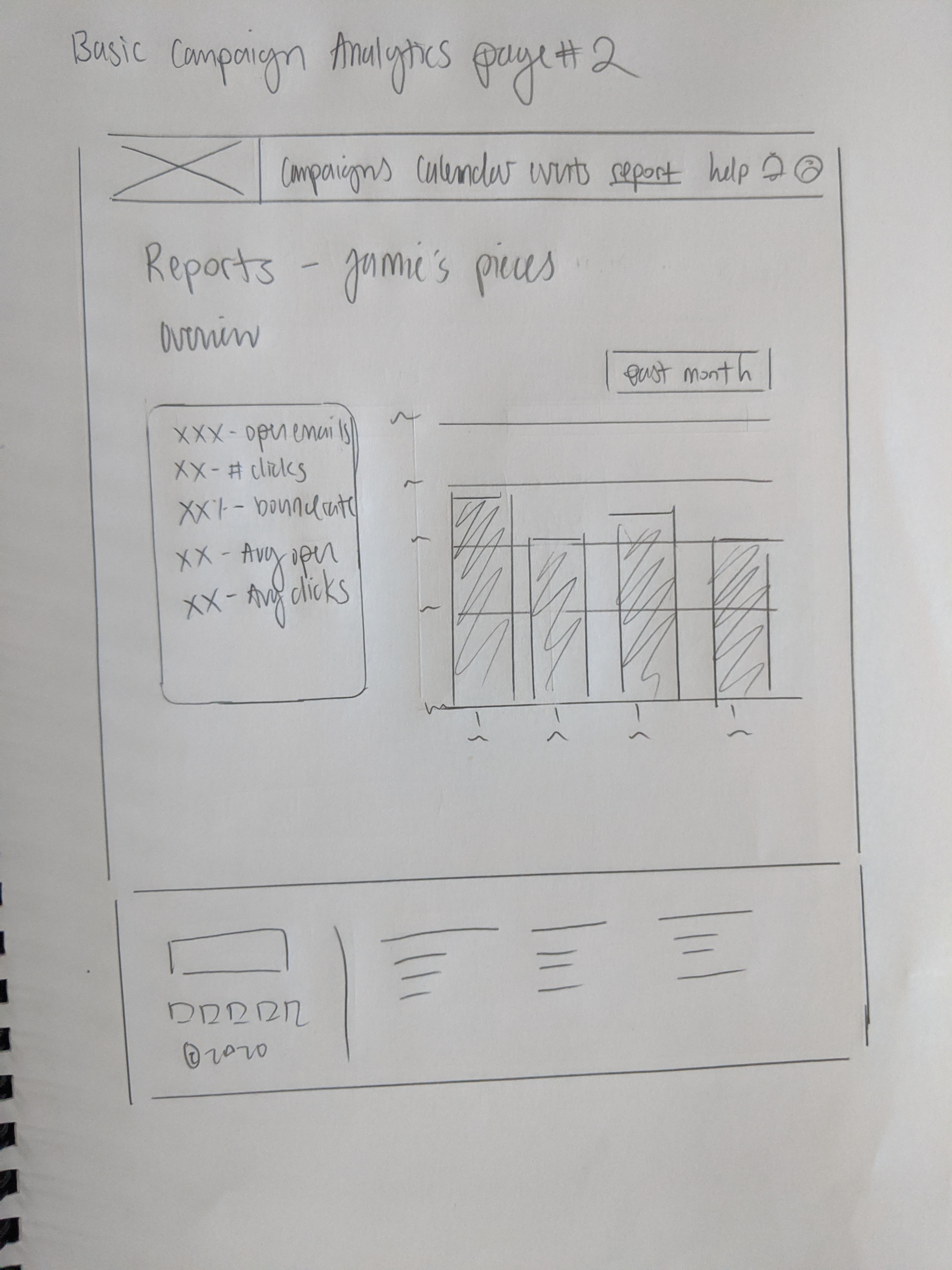
Approaching the iteration, I wanted to keep each page consistent with each other, aside from the template editing page, so that there is unifying theme. I ended up sketching out two ideas per page, and as I was sketching I kept in mind that this app should be intuitive for users within that age range.
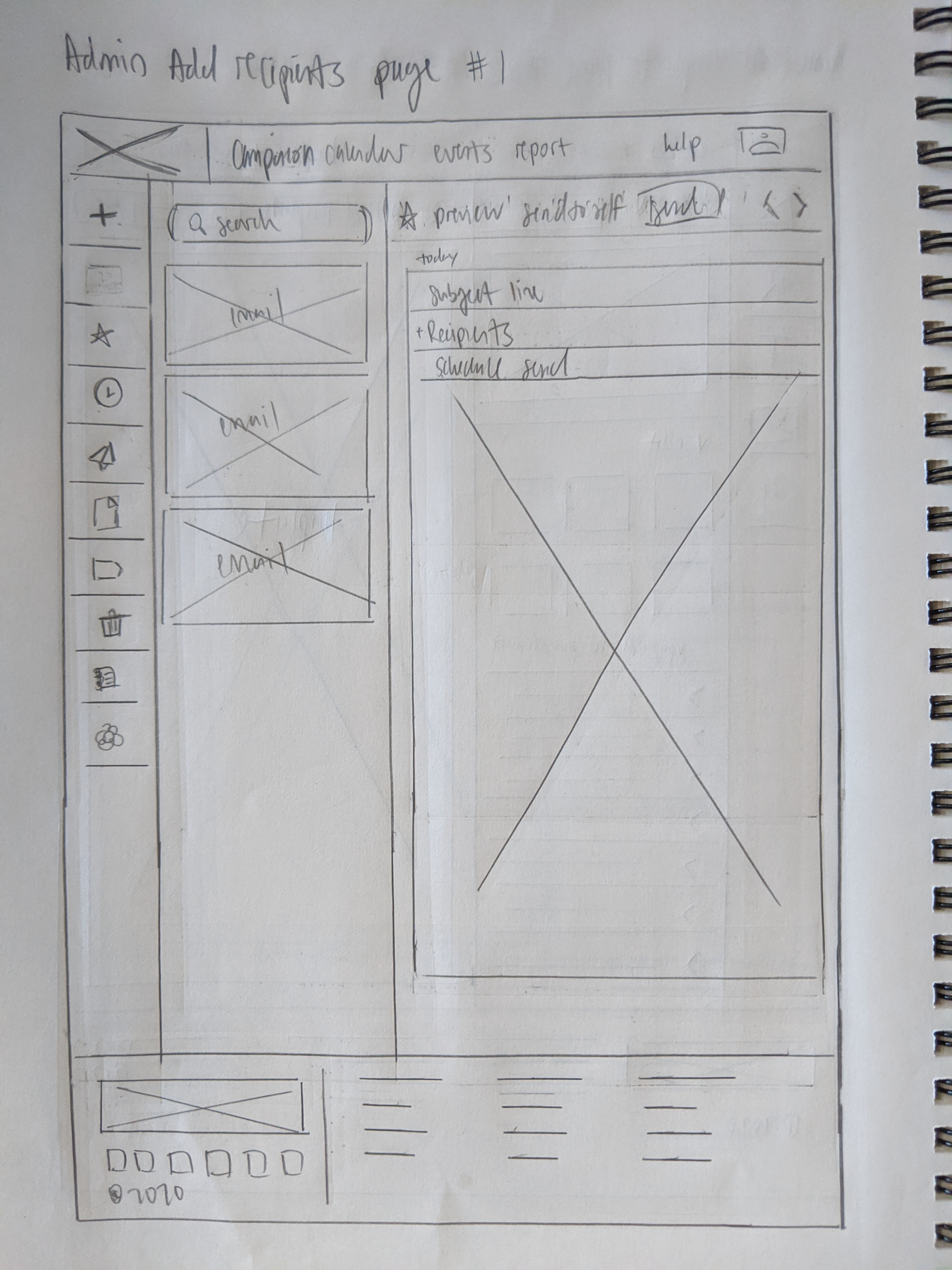
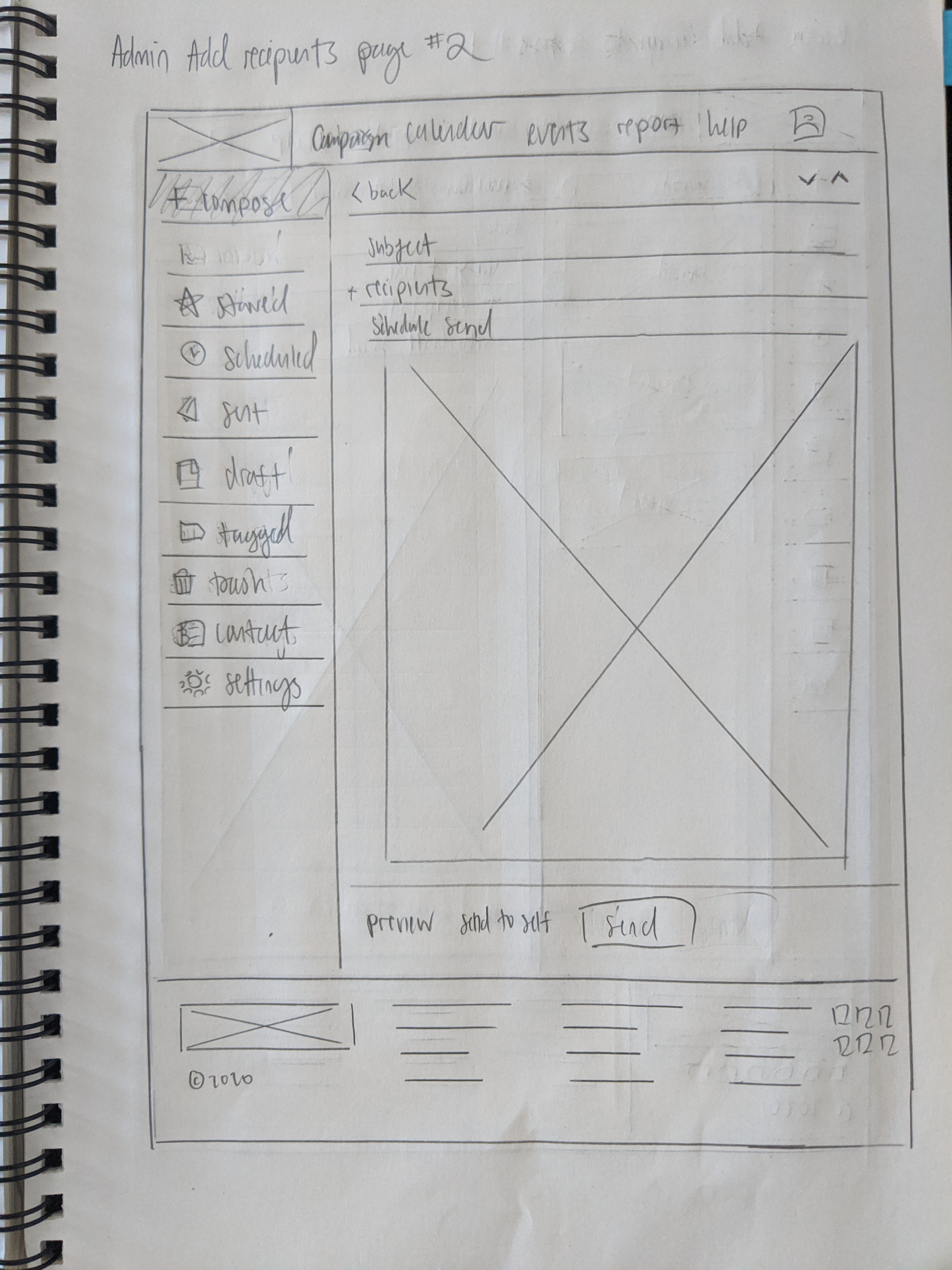
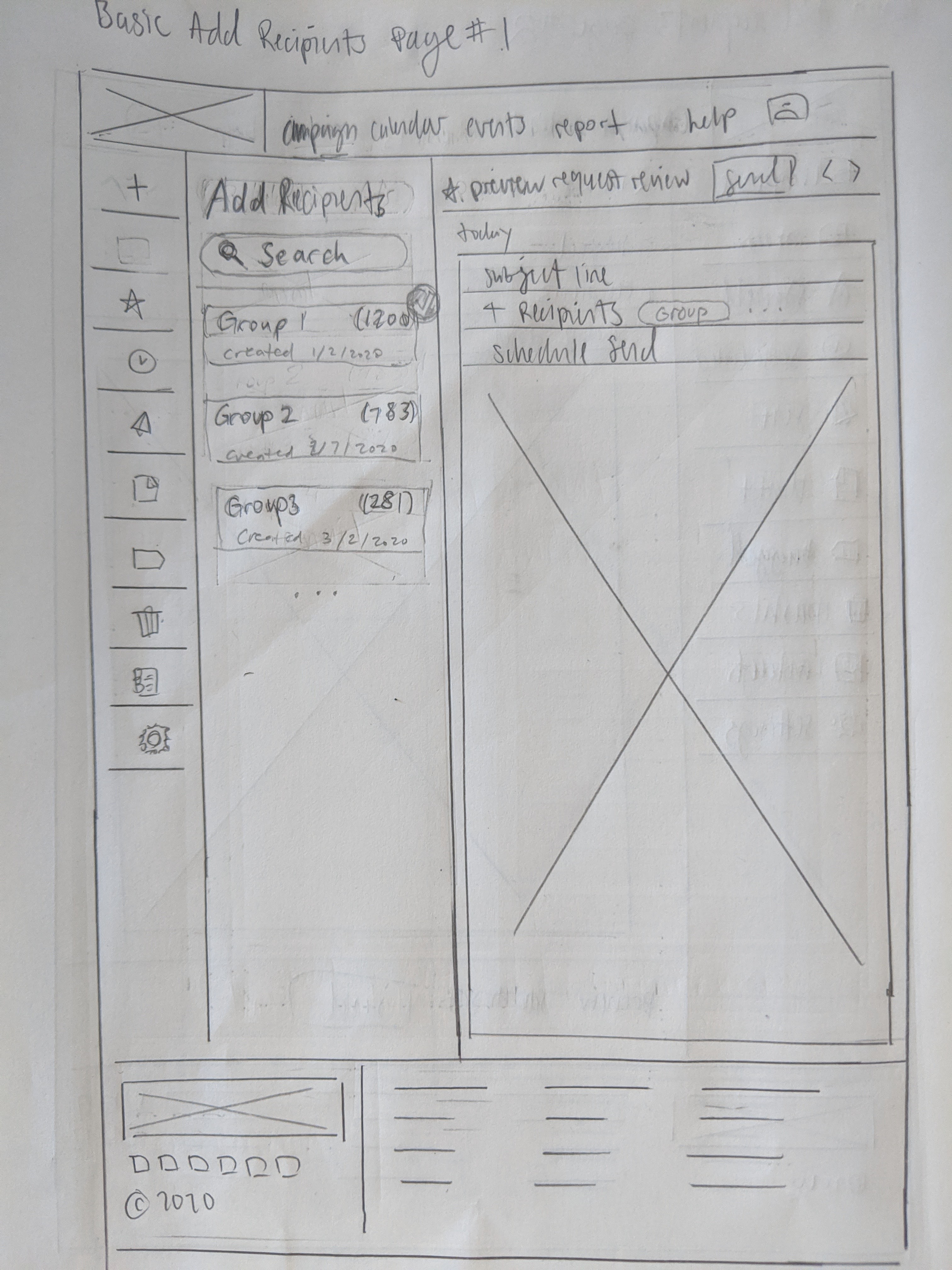
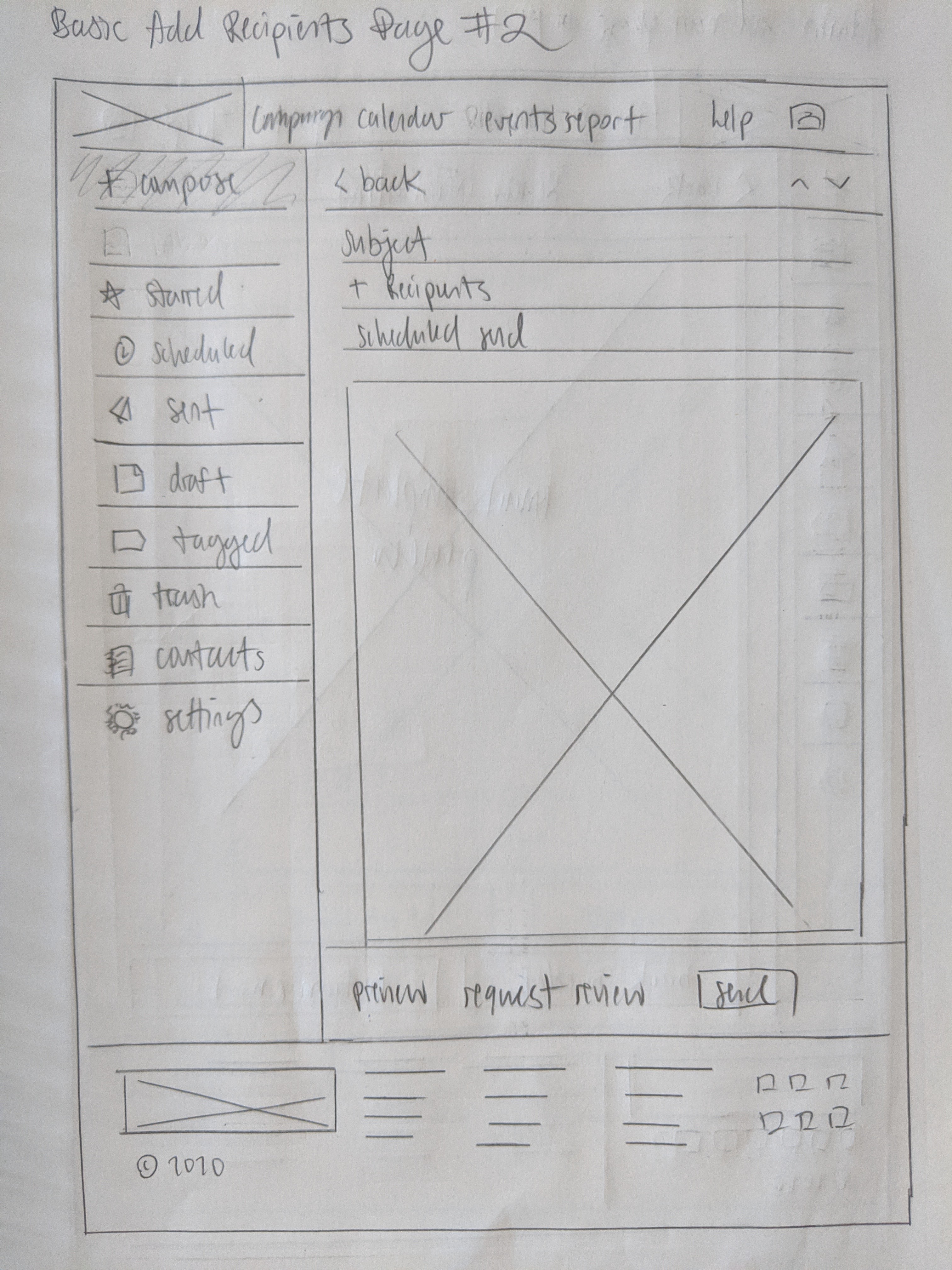
I tried to find as many examples from competitors like Mailchimp, Constantcontact, and Mailerlite as I could, but this was a challenge because I’ve never used those apps, let alone have an account to see how it works for myself. I also designed the add recipients and send mail pages similar to a regular email client, so that it would feel more familiar for those who have not used an email marketing client before.
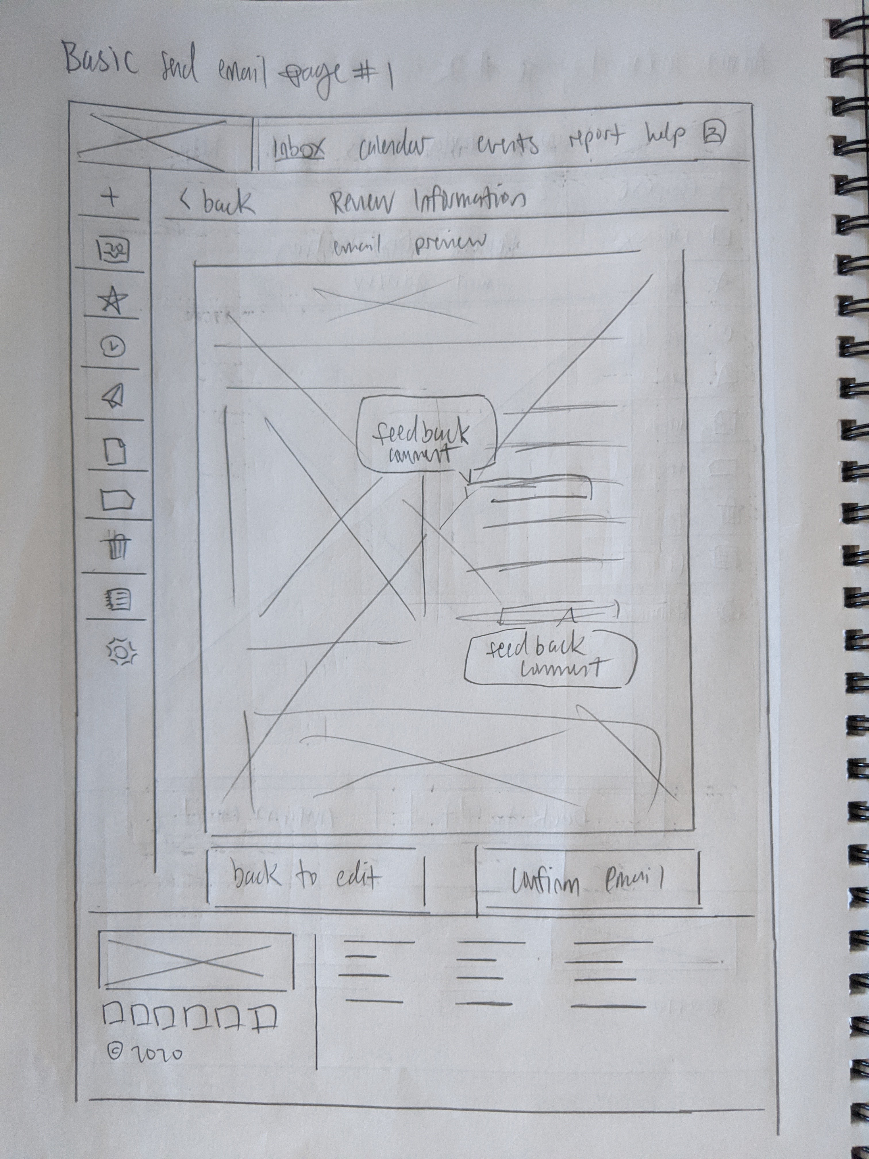
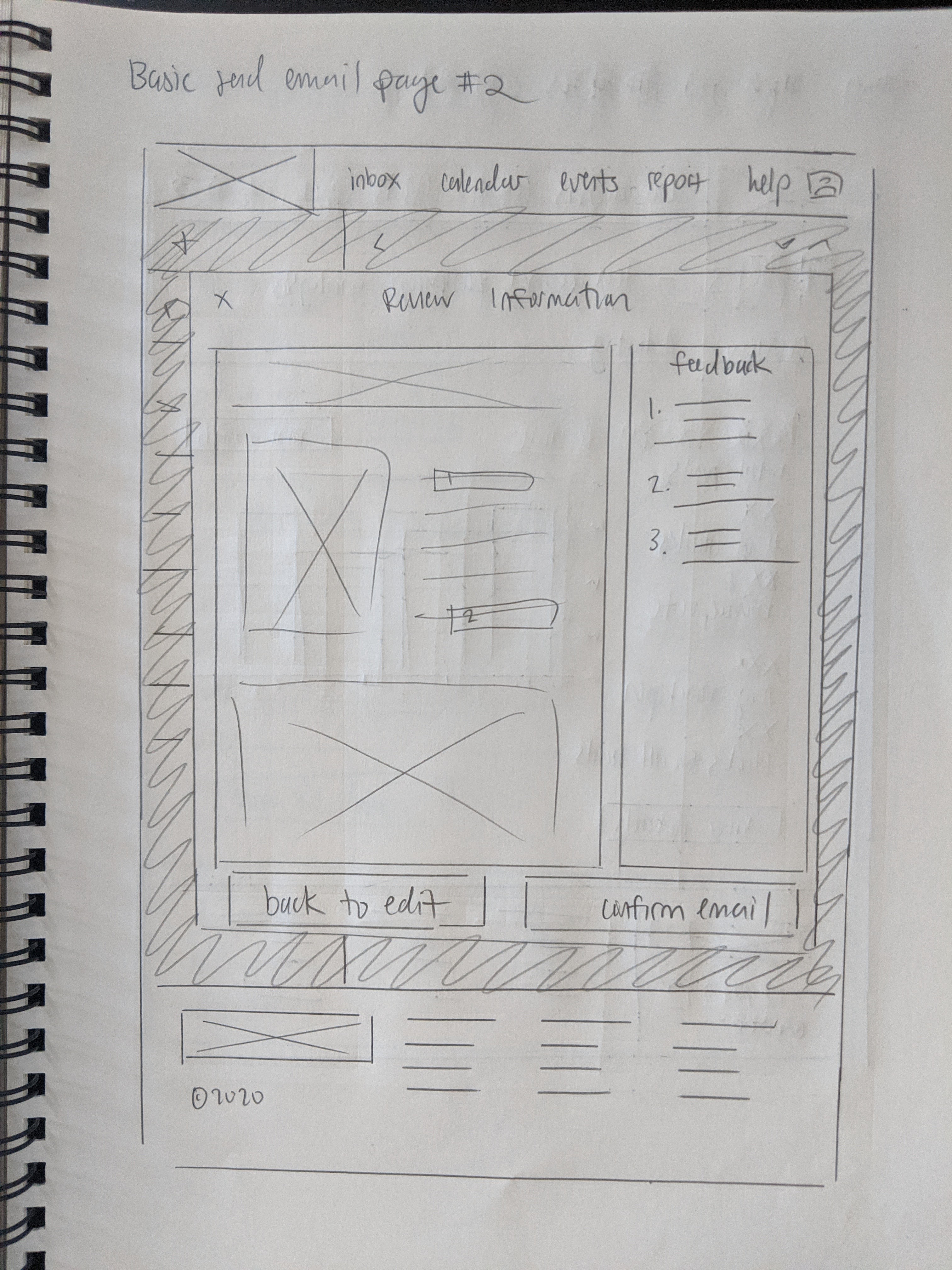
As I usually do when I transition from sketching to wireframing, I combined the best ideas from both sketches into the wireframes. Admittedly, due to my inexperience with these types of mail clients, I ran into a potential flaw in my design for the add recipients pages because I misunderstood the requirements. I ended up redesigning part of it by changing the preview mail section into an add recipient groups section so that I didn’t need to entirely redo the design, which I think worked out well.
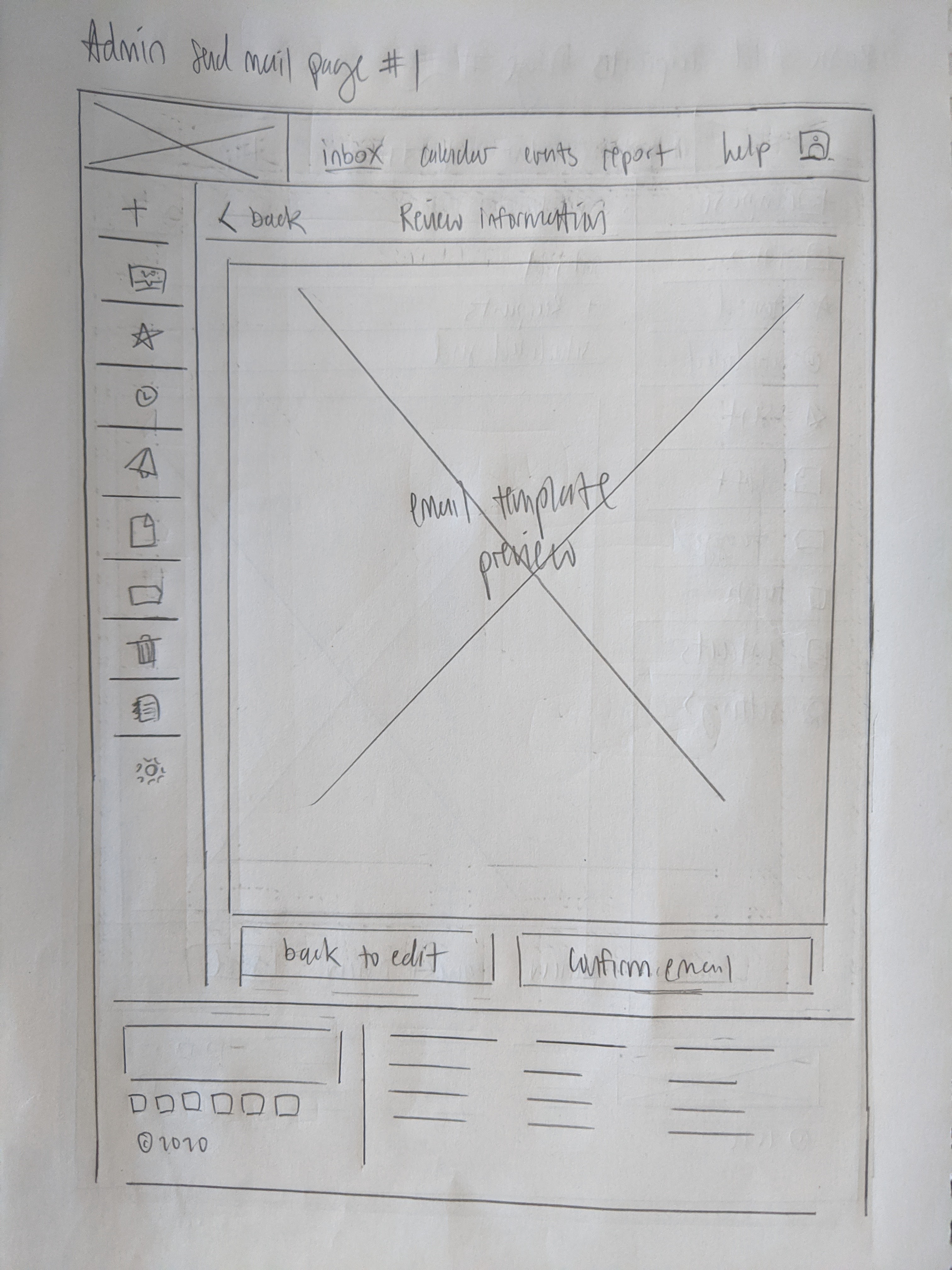
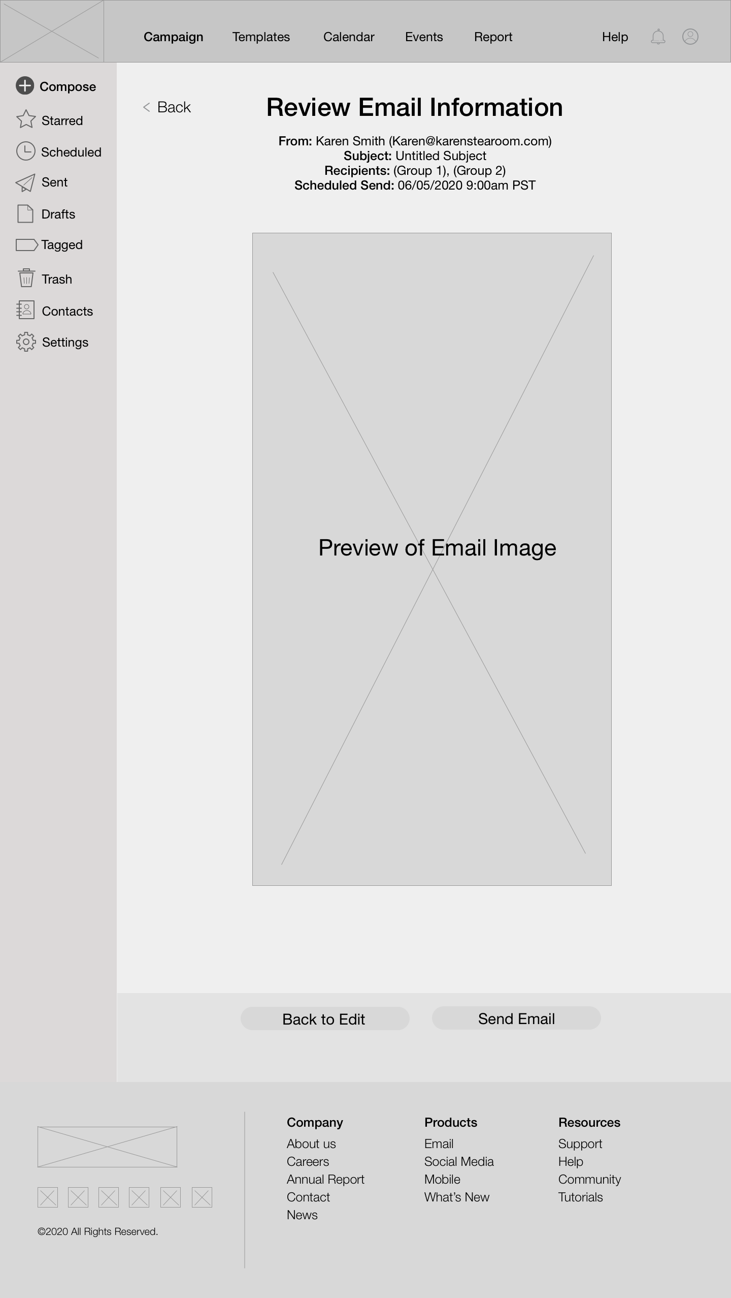
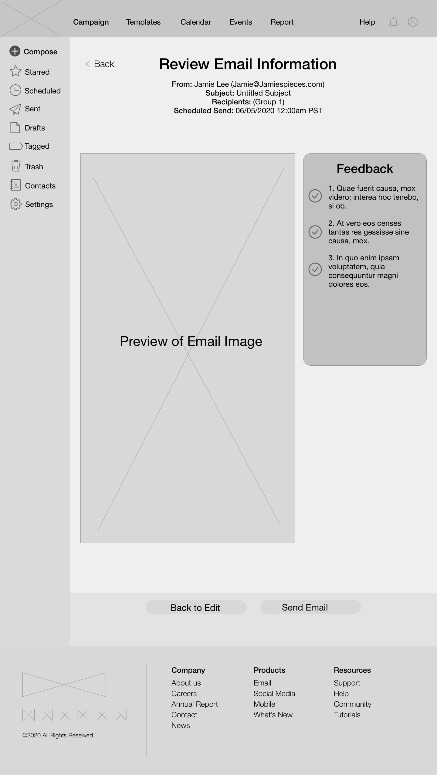
I added details above the email template image in the send email page to serve as a confirmation page and help users make sure that all of their entered info looks correct before sending. I also made both Admin and Basic pages similar, to keep a level of consistency in the site despite the difference in available features between each role.

I conducted user tests after selecting 10 users, and asked them to test out the wireframe version of the prototype. The group was split into two testing groups, one testing the Admin and the others testing the Basic user flows.
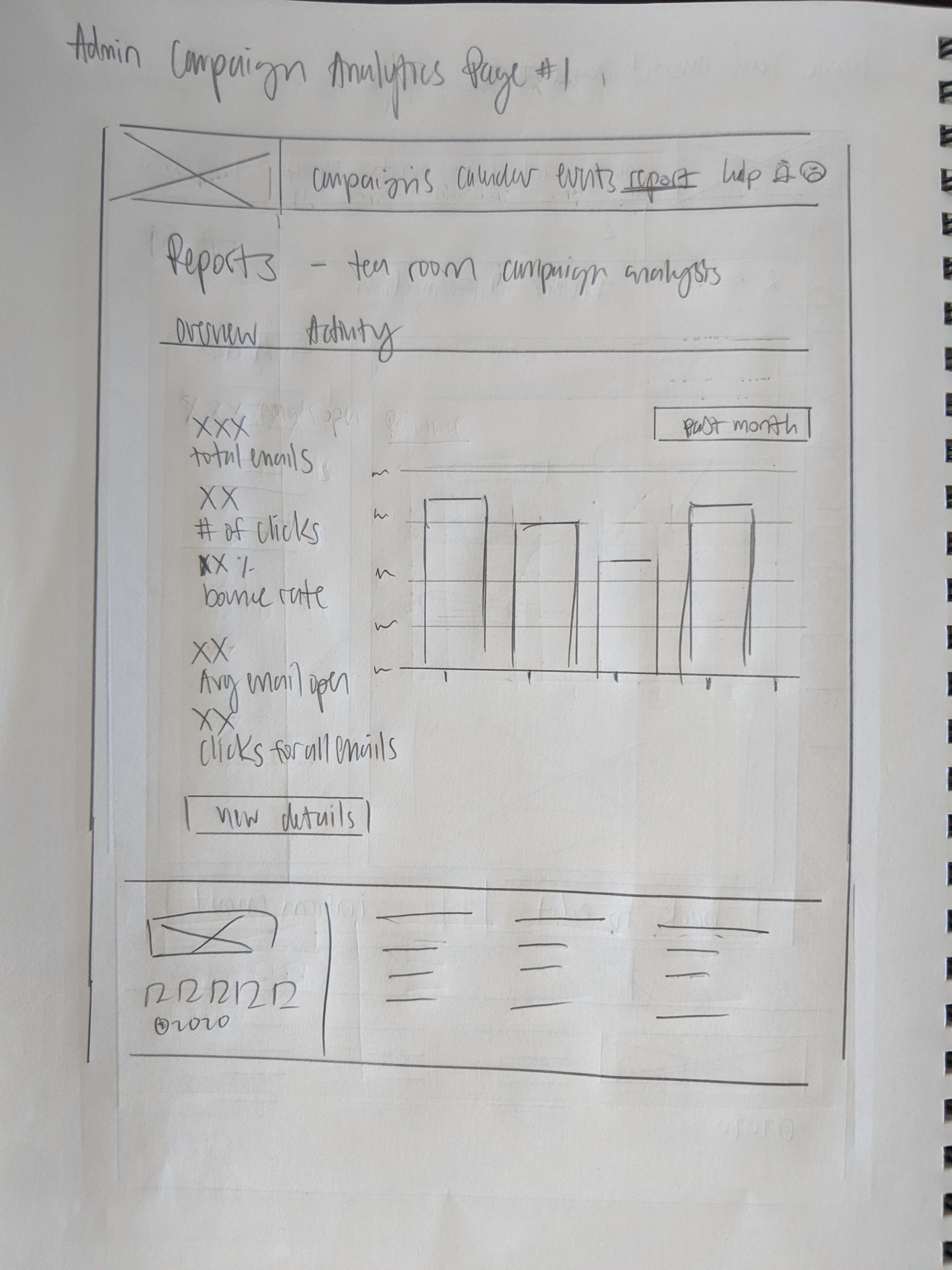
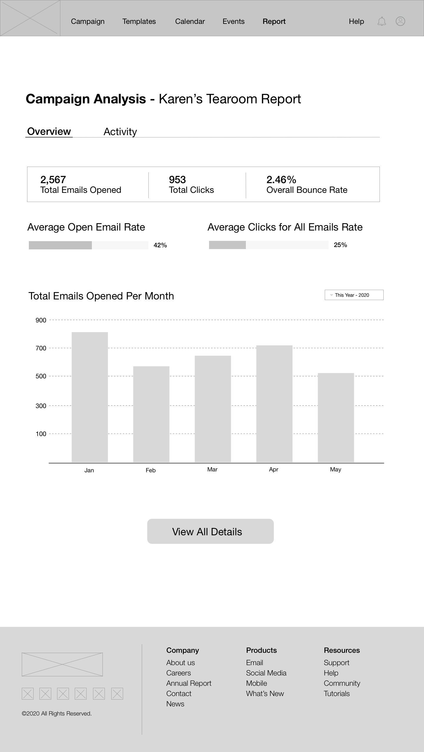
I went with a balance between mostly primary colors - red, blue, and yellow, with a hint of green within turquoise and creamy mint green. I featured the cool colors more to keep a sense of professionalism and used the other colors as accents. Red was used to create a sense of urgency when used in features such as the “new campaign” and “go back to campaigns” buttons, and in the graphs in the analytics page.
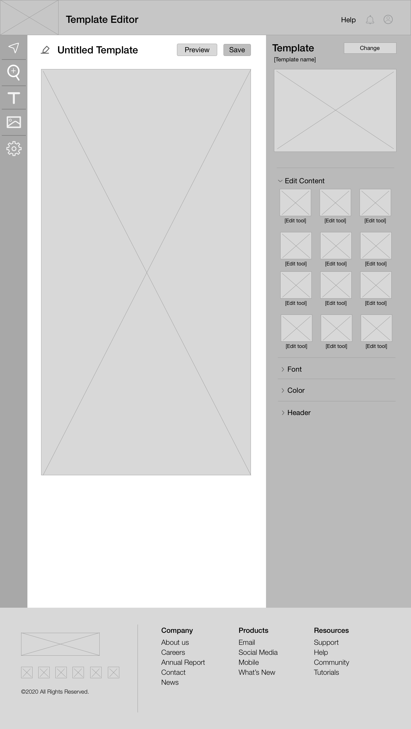
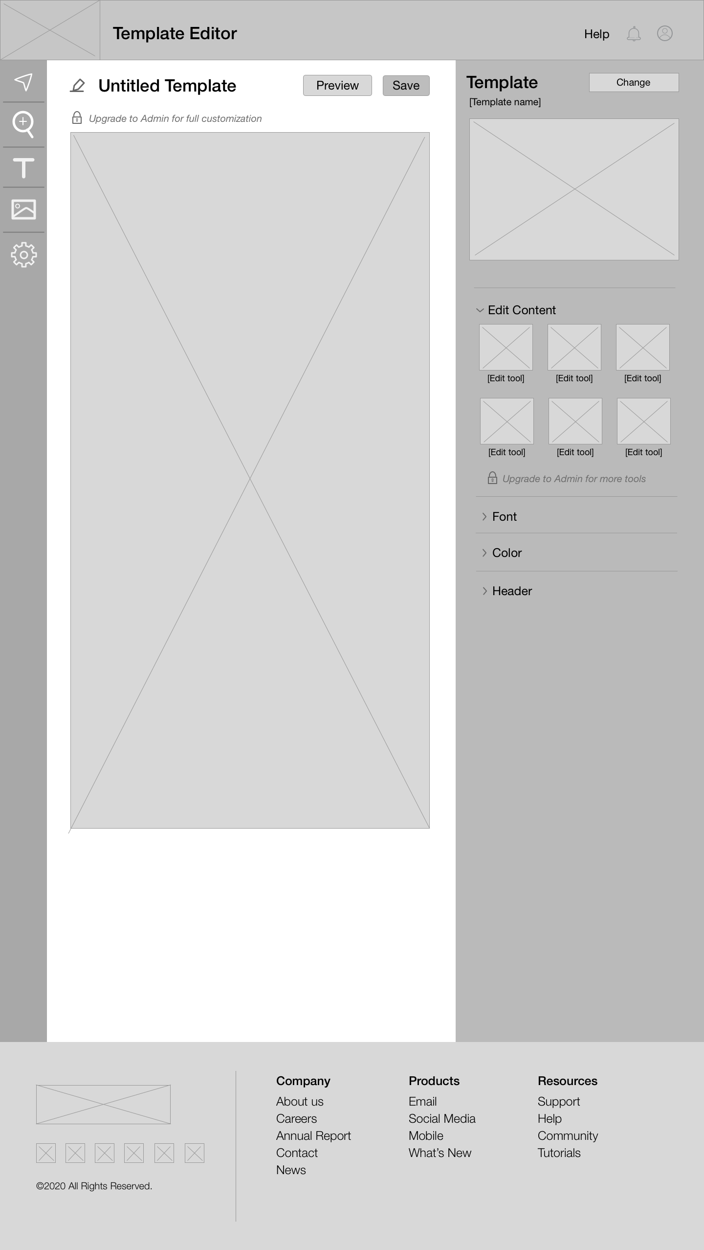
The template editor page is a dark cool theme to create contrast in comparison to the other pages, but also to make it easier on the eyes when users are editing their templates.
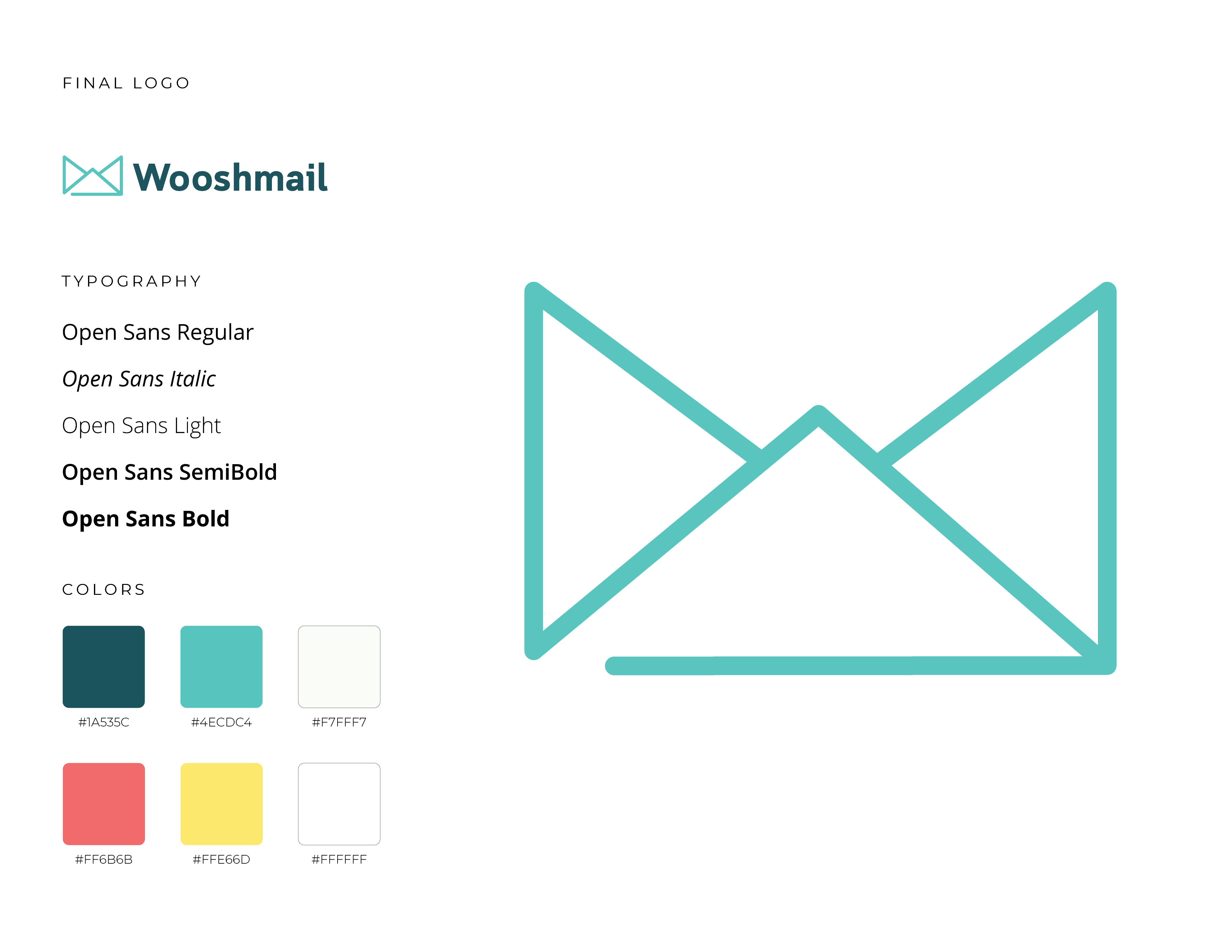
I chose to go with rounded edges for elements on the page, such as buttons, dialogs, and images. I felt that this conveys softness and friendliness to the users, and reflecting how easy and straightforward it should be to use the site. I also handmade the icons in the campaign and template editor pages to communicate what each tool does without the user needing to read the text.
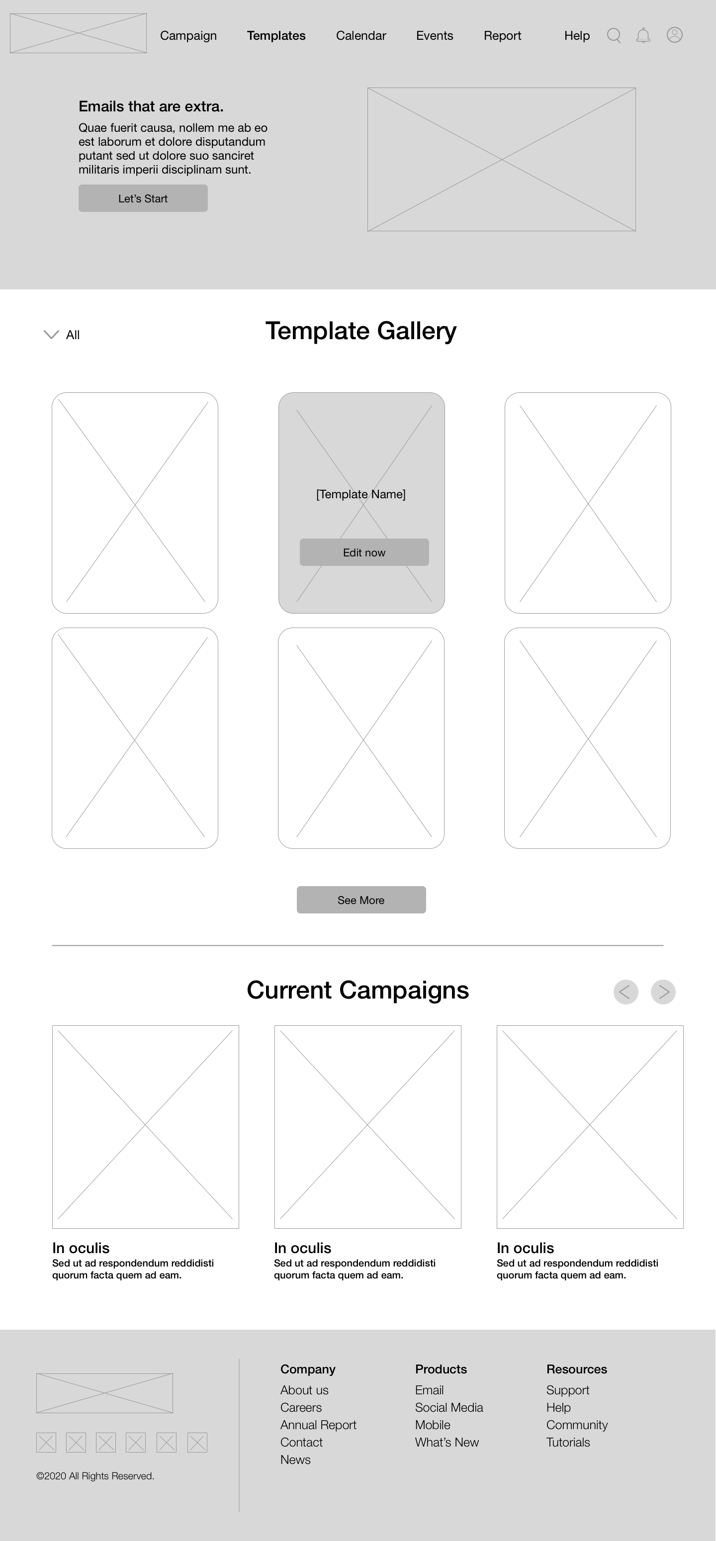
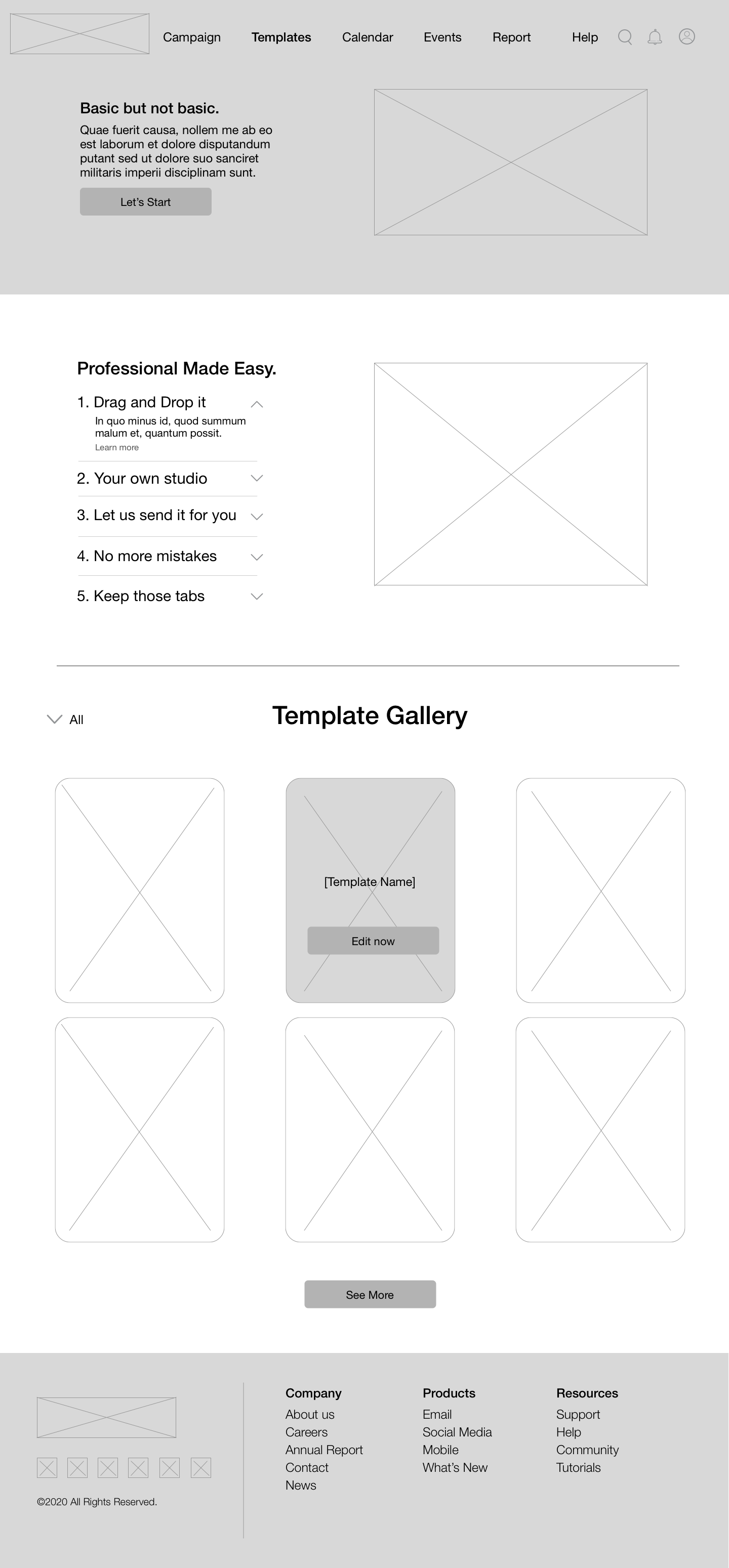
Create a new campaign from a selection of pre-made templates, free to edit and customize to exactly the way you want.
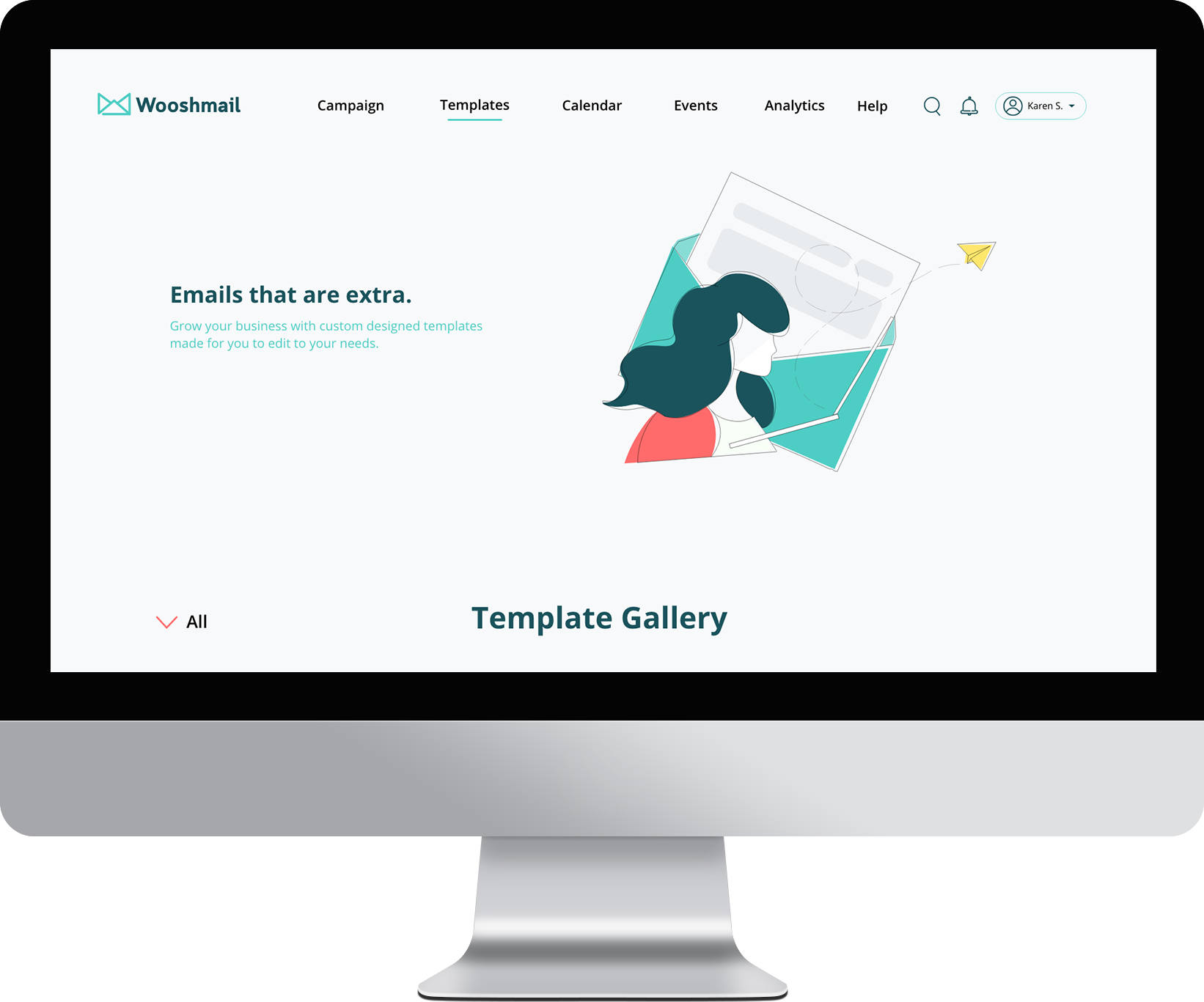
Picked out a template and want to make it yours? Use the template editor to drag and drop content, edit text, and customize it for your campaign.
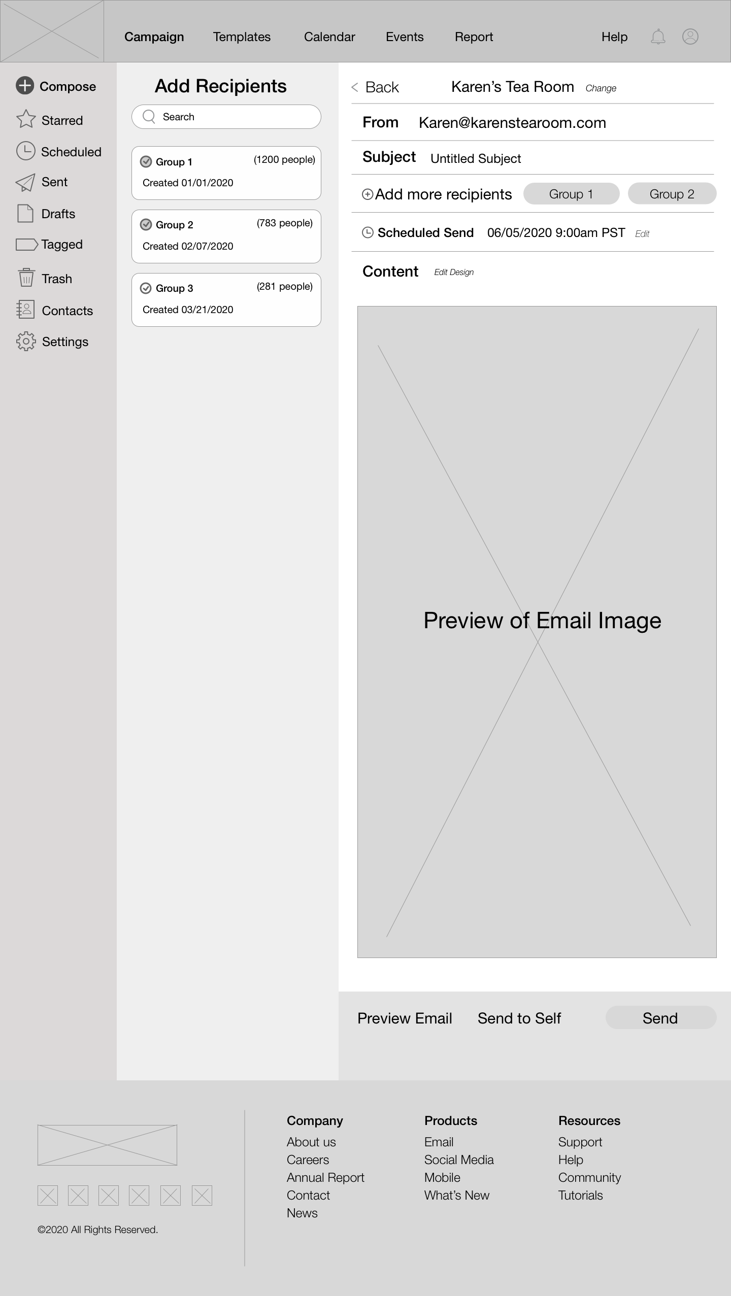
Ensure your audience gets your message with recipient lists and scheduled sending. The review page helps you double-check that your email looks as you expect, and the sent page confirms that your message was sent.
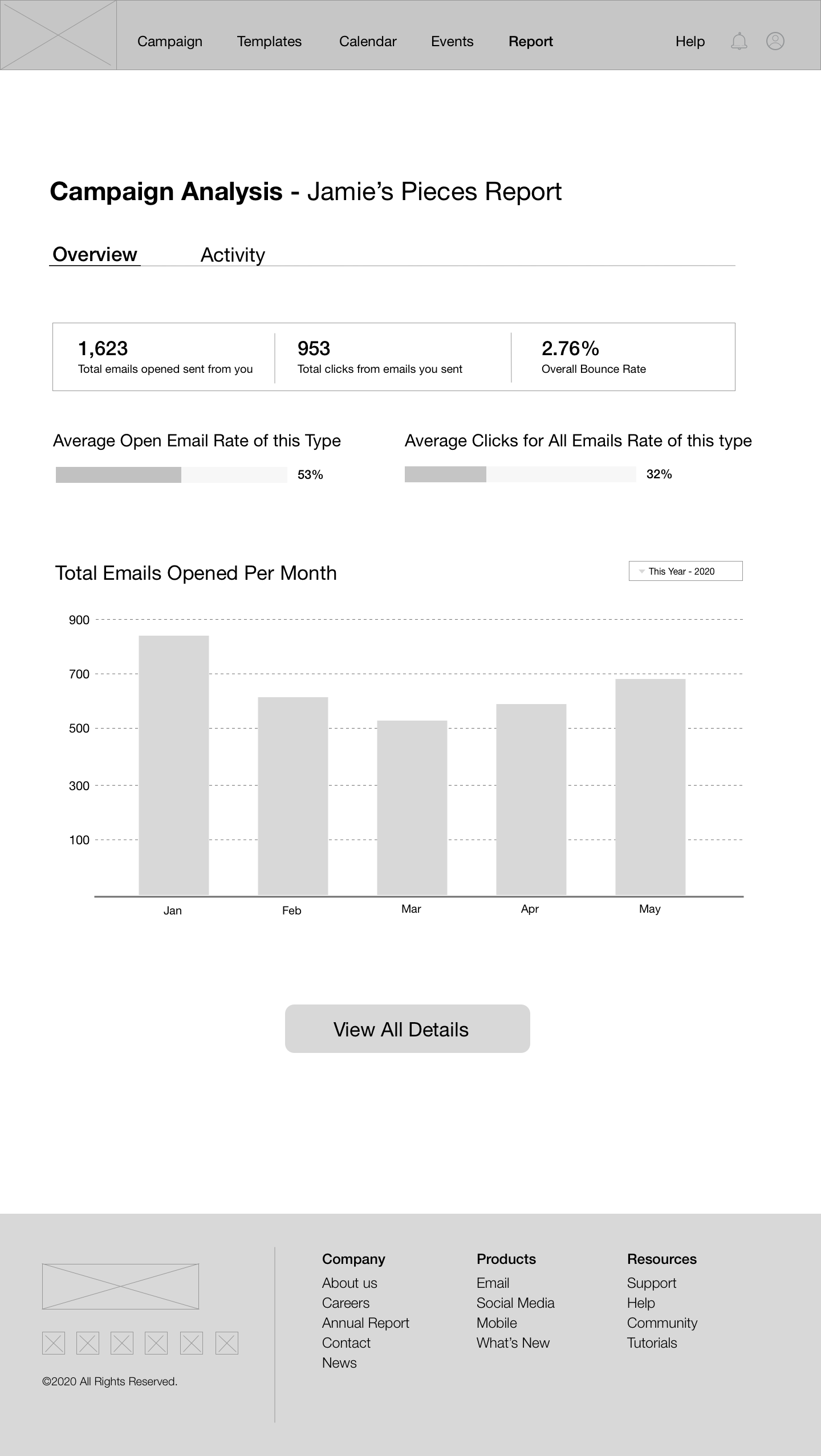
Take a look at your campaign stats all in one page. Share the data with your team, print it out for later viewing, or edit your campaign to optimize your results.
Just starting out? Don’t worry. We have steps for basic users that walk them through how to Wooshmail.
As a basic user, it’s always good to get a second opinion before sending. Admins and collaborators can take a look at your email draft and directly share feedback with you.
Admittedly, this project was difficult for me to understand in the beginning, as I had never used a B2B email marketing website before. However, I was able to take advantage of this by looking at the problem from the perspective of users trying to use a site like this for the first time. I used this to try to confirm my understanding of the problem and design user flows that would work well for both new and experienced users. As a result, I feel like I have a better understanding of how to design for a B2B client, how campaign sites like these work, and how to design for two different types of users for the same site.
Next time, I would definitely try to do better research on email marketing websites. I would even go as far as creating accounts on these sites and try them myself to get a better understanding of how they work. This would let me gain more confidence and confirmation in my designs. I would also make the differences between Admin and Basic sites more apparent, as both sites look very similar currently.
Regarding user testing, I would create more specific and targeted questions to ask my users as they test, so that I know where exactly to revisit or make changes to. With the mockup designs, I would take the time to try various color palettes to see what looks and fits best with the site, since I feel that there is quite a bit of white space on the template gallery page. And finally, if I had more time, I would create mockups for more pages to make the site look more cohesive and complete.
