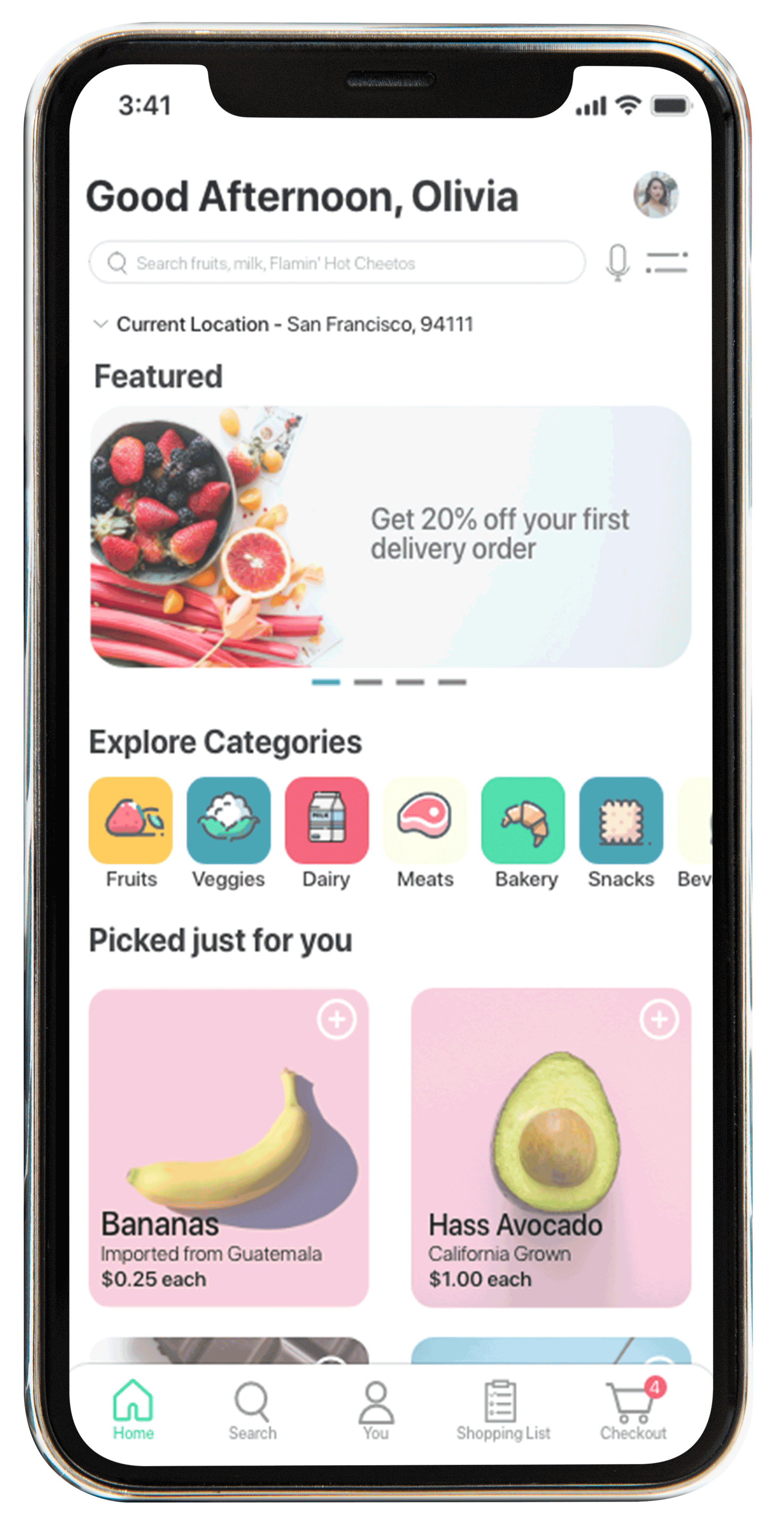
This is the second project of a series of UX projects done for the Treehouse UX program. The task was to design a mobile app for a grocery store to solve pain points in users' grocery shopping experiences.
I started with research to figure out what direction I wanted to take with this app, which involved interviewing people on what their overall experiences were with grocery shopping. I interviewed those who were within my target audience -- those who were within their early 20s and above, and living on their own and/or goes grocery shopping regularly.
After gathering information from all the interviews, I analyzed the common pain points and began prototyping and generating mockups.
Role: Research, strategy, design
Team: Solo project
Length: April to May 2020
Tools: Adobe XD, Illustrator, Photoshop
Grocery shopping experiences tend to be either a neutral or unpleasant experience for most people. With the introduction of COVID-19, not only has it made some of these issues worse, but new problems like products going out-of-stock arose. I sought out to identify the 1-2 most pressing problems that people have with grocery shopping, and design my app in order to solve them.
First, I wanted to discover what kind of issues people experience when grocery shopping. Since asking people directly what those issues are could bias their responses, I came up with a list of 5 areas of inquiry that I would ask my interviewees about, in order to identify trends and patterns among my audience. Since this project was done during the height of COVID-19, I also wanted to focus on people's experience with quarantine.
Five people were interviewed over video/voice calls, who were all within the target audience.
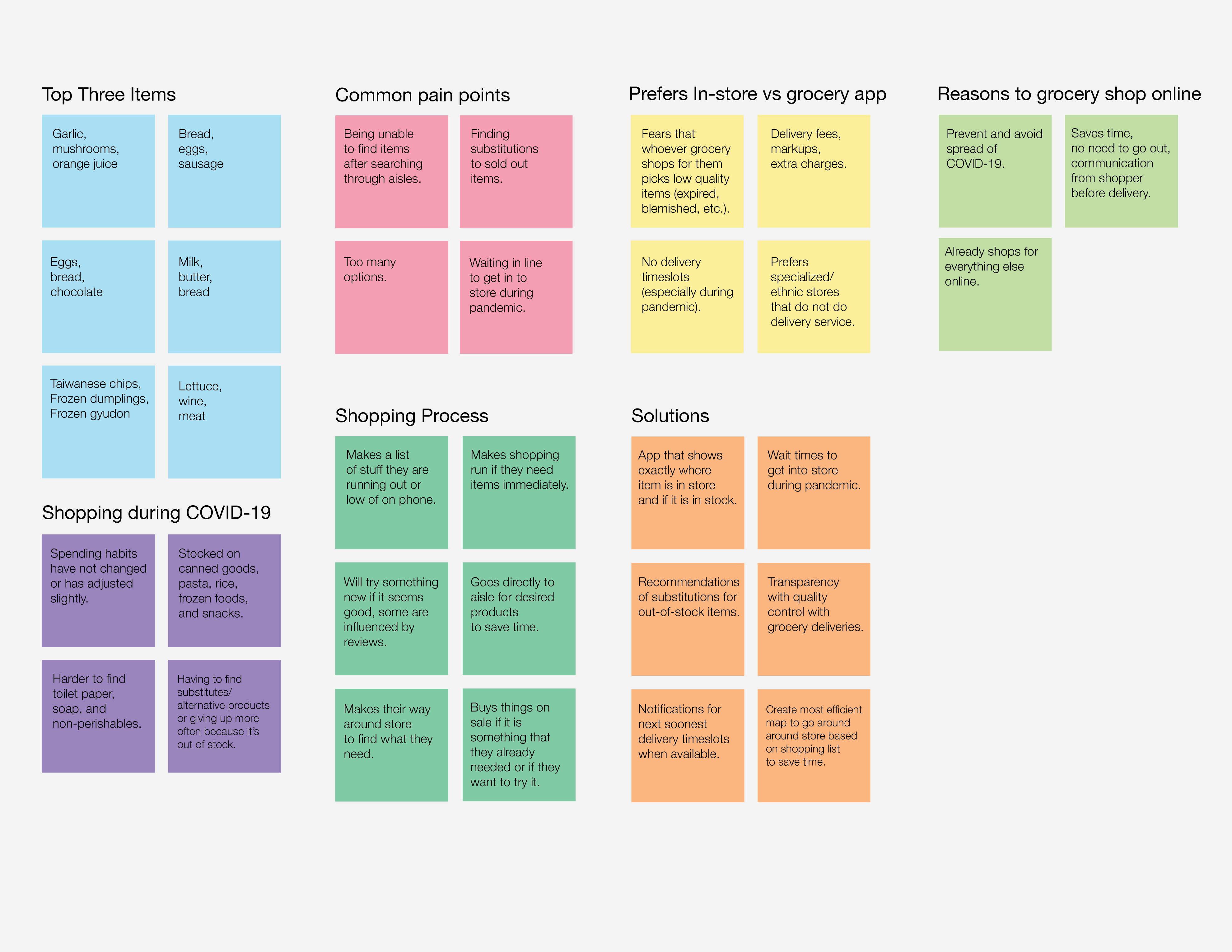
The most important pain point I identified was that too much time is wasted by hunting down specific items that may be unavailable. This is a concern that is more apparent during this pandemic, because a lot of time is required to search for that item, or having to research alternatives if it is out-of-stock. Throughout all my interviews, this issue was definitely the most common, and so solving this would greatly improve the target audience’s grocery shopping experience.
I took each major point and noted them in a diagram to get a better sense of what issues arose during each conversation I had with each of my interviewees. I also took the opportunity to get to know what their top three items when shopping were, just for fun.
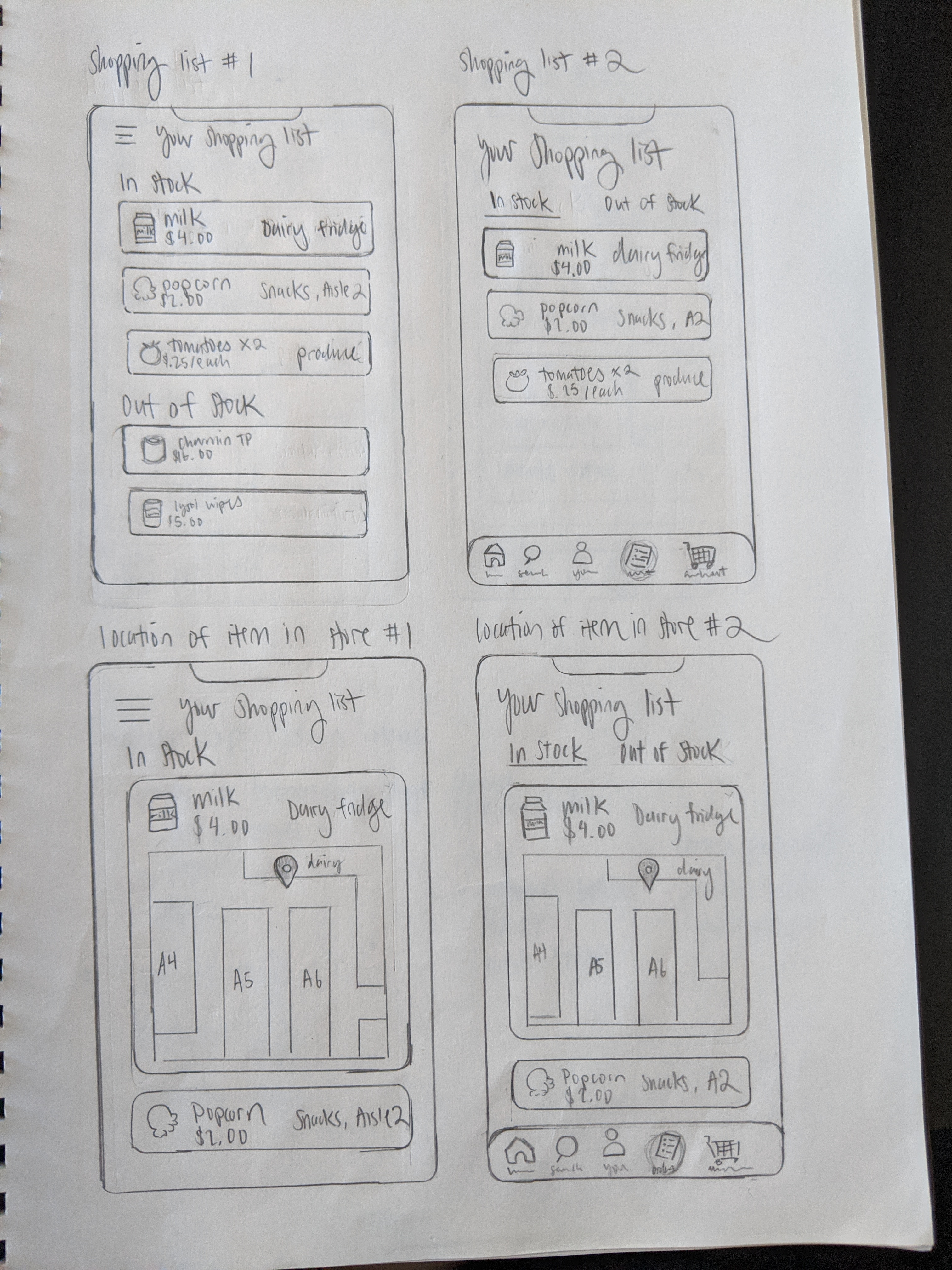
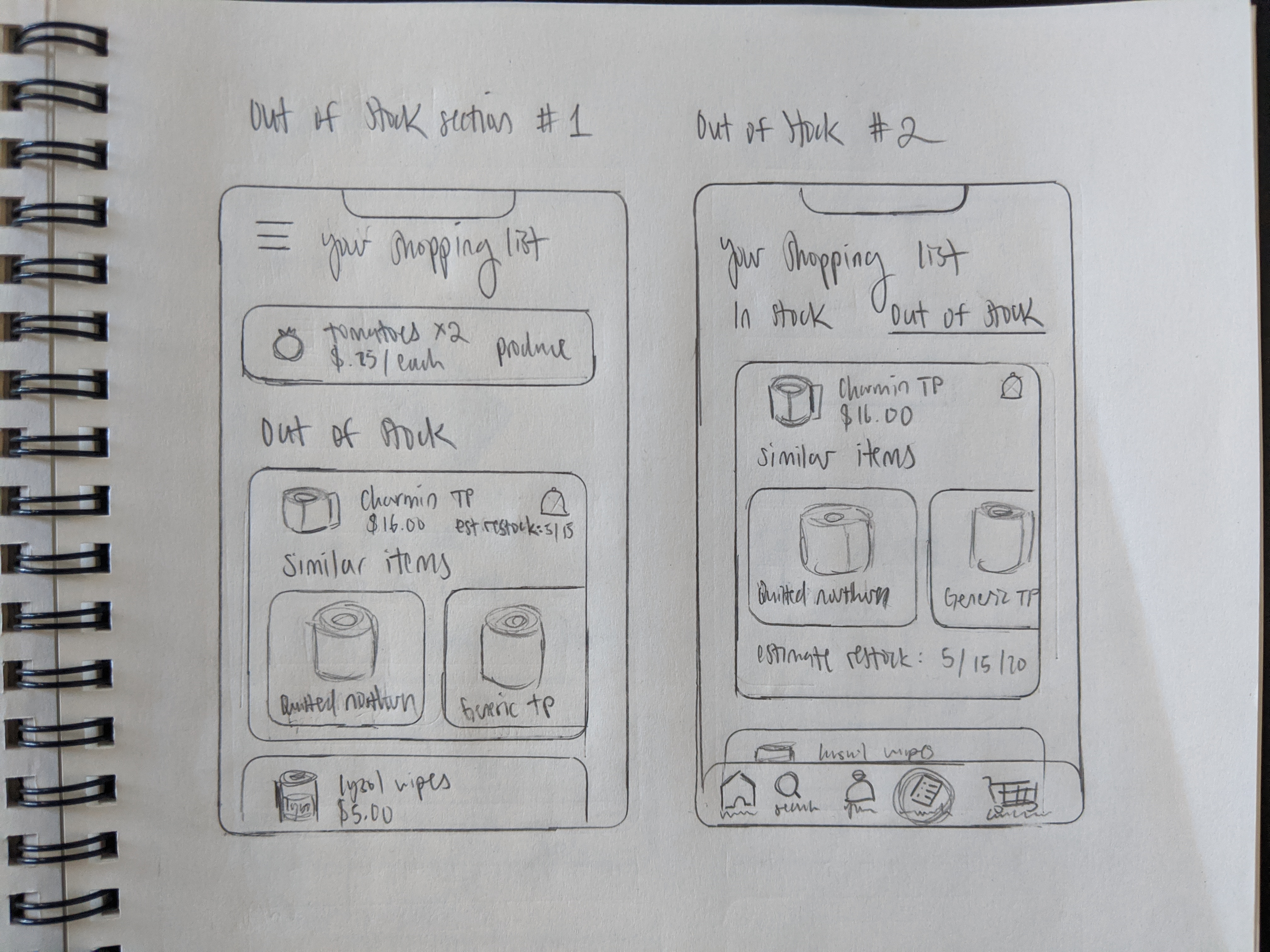
To solve the pain point, I wanted to make an app that shows exactly where an item is in the store if it is in-stock, and similar alternative items if that exact item is not in-stock. I want to make this information easily found in the app, either in the shopping list or by browsing individual items in the catalog.
For example, when looking at the shopping list, it will show items that are in stock and their in-store location, and show items that are out-of-stock and similar options. Another feature I’d like to implement is to show users whether an item is low on stock and how many remain, and an estimated date it’ll be restocked.
I took inspiration from popular shopping apps like Target, Shipt, and Instacart during my ideation phase. I also looked at Pinterest and Dribbble for design inspiration for my features, layouts, and colors.
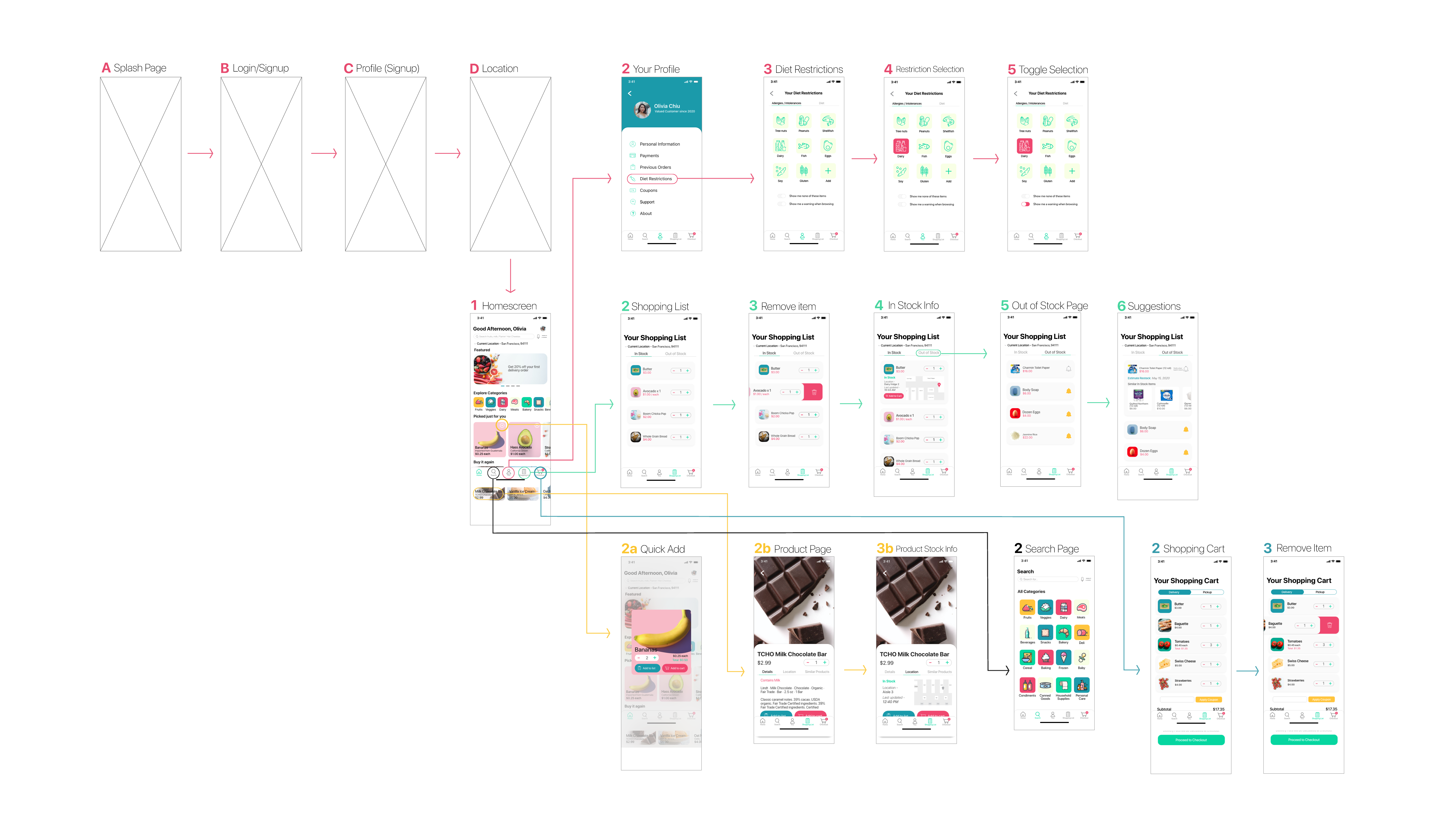
Roughly, I imagined the following steps for how a user would use the app. The actions that the users would take roughly aligned with the individual screens I would create for the app.
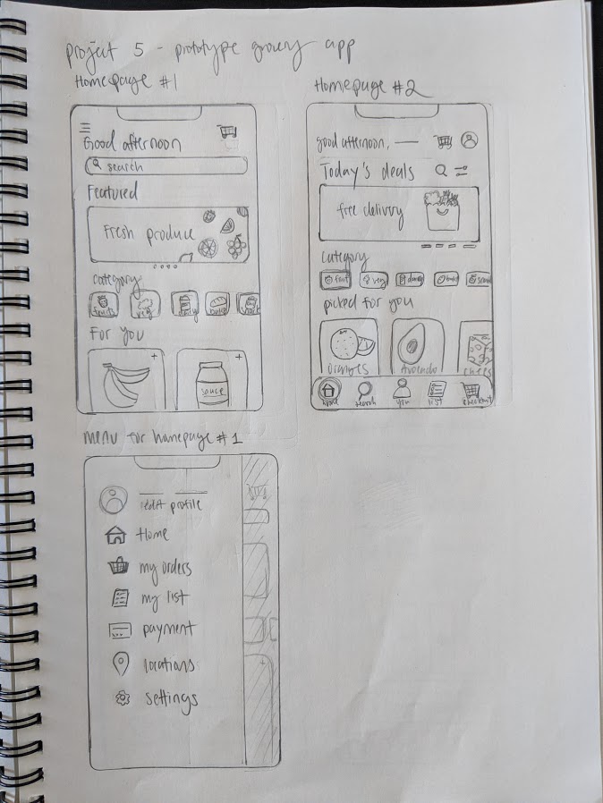
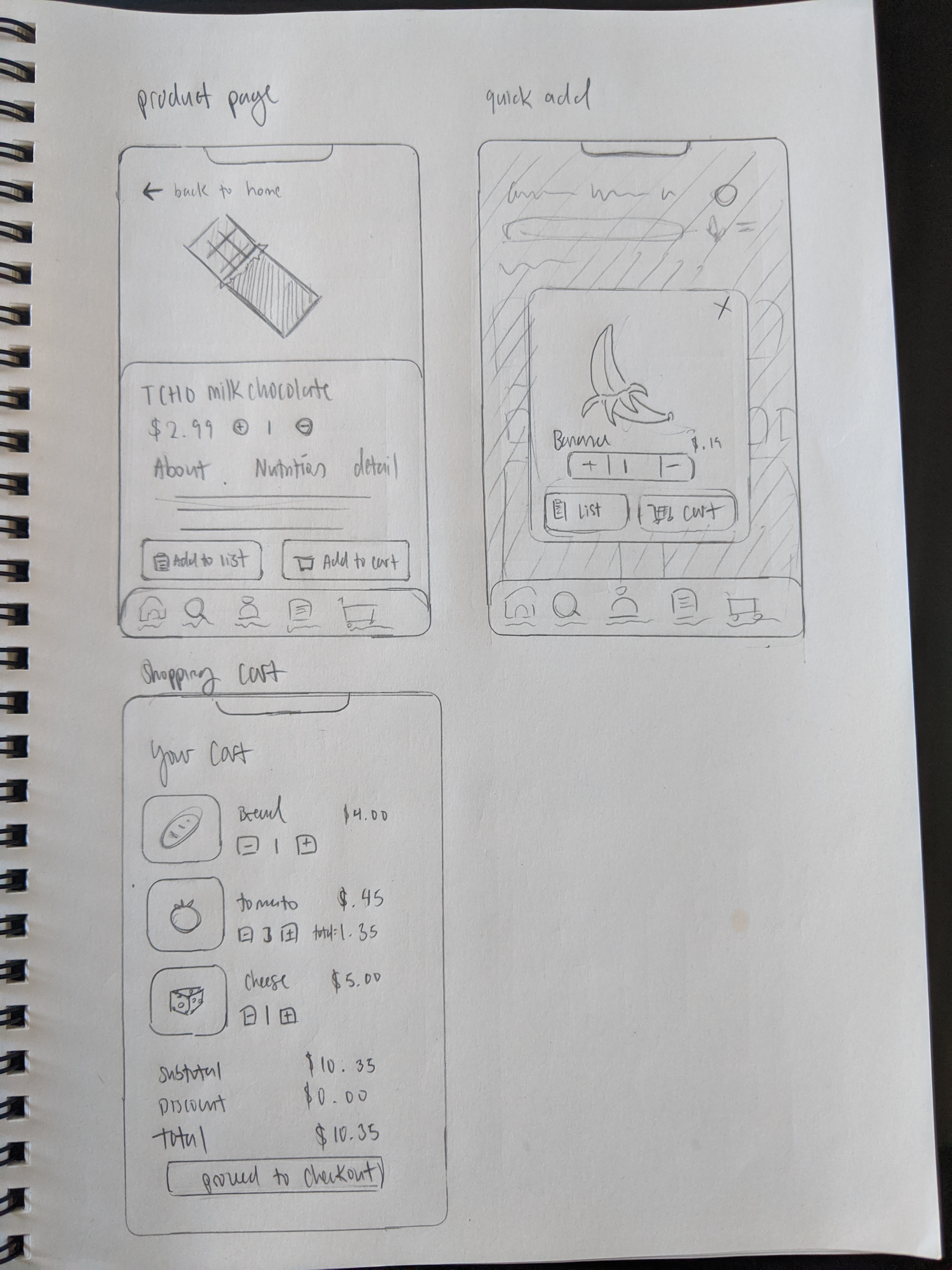
I tried to sketch out at least 2 different layouts for each screen, so that it would force me to come up with a variety of designs.
With the sketches complete, I looked over each screen and identified the best characteristics and ideas from each sketch, and incorporated them into the wireframe for that screen.
I conducted user tests after selecting five users within the target audience, and asked them to test out the wireframes version of the prototype. For each test, I encouraged my users to think aloud and say whatever comes to mind, so that I could collect a lot of feedback and thoughts. After completing all the interviews, I combed through the feedback to summarize what people liked about the design, and what areas to improve.
As this was my first time designing for mobile, I decided to take a straightforward approach. I used an official UI template kit from Apple and downloaded their SF font to use directly with Adobe XD.
For colors, I went with a set of colors that were similar to primary colors but easier on the eye, since many in my target age range are adults. I wanted a color set that I could use as an accent, to emphasize certain areas, rather than an all-around color for each page.
In terms of shapes, I went with curved edges with all boxes and buttons to create a sense of friendliness when using the app, and to make it easier on the eyes.
After gathering feedback from my user tests, I made some adjustments to the mockup before creating the final version of my prototype.
Easily explore categories and new deals of the day! Items personally selected and featured, so you’re one click away from adding a favorite to your cart.
Add an item to your list or cart without leaving the screen by clicking the add icon on the product, making it easy to add multiple items.
View everything on your list that is in-store, and know where it is exactly in real-time. You can also know what’s out of stock that day so you don’t waste time looking for it in store. Removing an item and editing the quantity is also easy.
Vegetarian? No problem. Mark down what you can’t consume in your personal profile and you won’t see those items recommended to you. You can even set an option to never see certain products or just see a warning on their description.
In this project, I learned how to design mobile apps - and honestly, I actually enjoyed this more than designing website pages for desktop. It's been a dream for me to be able to learn how to do this, and I really like how nice and clean this came out for my first time designing for mobile.
I also learned about pain points of users and how much I need to know about my users before designing. I learned how to create something that actually addresses their needs, rather than what I assume they need.
I also took the opportunity to use this project to learn how to design on Adobe XD after using Sketch in the previous project.
Though I took inspiration from apps like Instacart, Target app, and Shipt in designing this app, for next time, I would spend more time on looking at similar apps from competitors. I would make thorough comparison notes to see what each excel at and what could be improved, and use it to make my app even better.