This was my submission for an Uplabs weekly design challenge,
where the prompt was to redesign IKEA's shopping app. I worked
on this as a solo project over the span of 2 weeks.
IKEA is one of the most popular home furnishing brands globally
with its variety of Scandinavian designs to suit a range of
living aesthetics with affordability. They have a wide catalog
of products on both their website and app — which many shop and
order directly from. However, there are some features that could
be improved or added to create an even better shopping
experience.
Role: Research, Product Design, Prototyping
Tools: Figma
Timeframe: November 2022

My first step into taking on this challenge was downloading the app, using it myself, and taking notes of my impressions and pain points.
Afterwards, I looked into the app's reviews in the Google Play Store and took note of some of the most common pain points users have mentioned.
From my research, it seems like the biggest pain point to resolve is the issue of conflicting item availability information between in-store stock and online.
Since 2020, IKEA has been going through supply chain shortages and limited stock of some of their items. This leads to frustration and confusion from many customers who are seeking to purchase certain items on their website or app only to see it be unavailable indefinitely, despite still being listed online.
As this was meant to be a quick challenge with a deadline, I mostly focused on solving the main pain points I observed while using the app and several improvements to the overall design.
I identified three areas for improvement:
I researched other commerce apps (Amazon, Target) and looked at inspiration from related ideas on Dribbble and the Figma community, plus some past submissions for similar prompts on Uplabs. Afterwards, I drew up some initial sketches before moving over to Figma to create a set of wireframes.
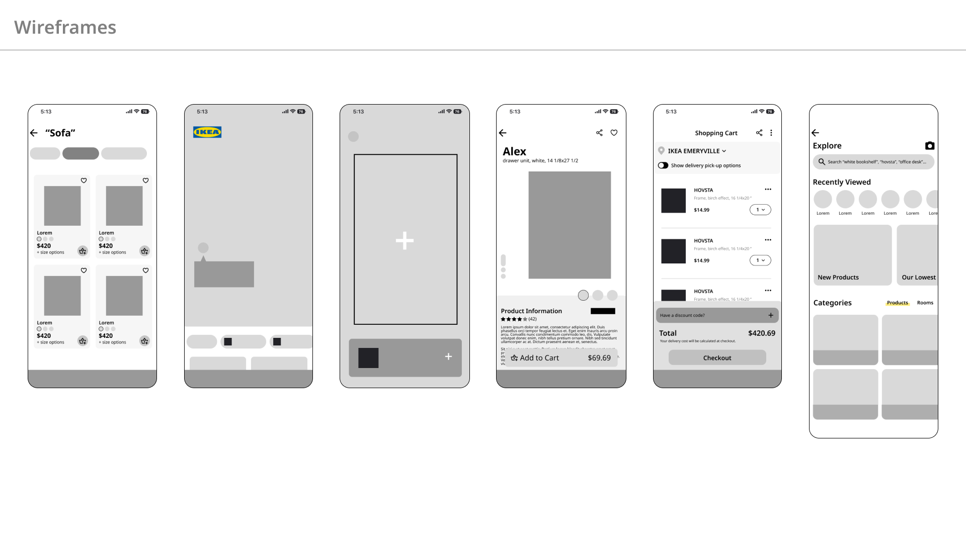
View today's featured products in a full-screen, interactive landing page, and browse for inspiration.
Quickly find the product you're looking for by browsing by categories.
View essential product information at a glance to help you make your decision.
Use your phone's camera when you're shopping in-store to easily save products as you come across them.
View the products in your shopping cart and checkout.
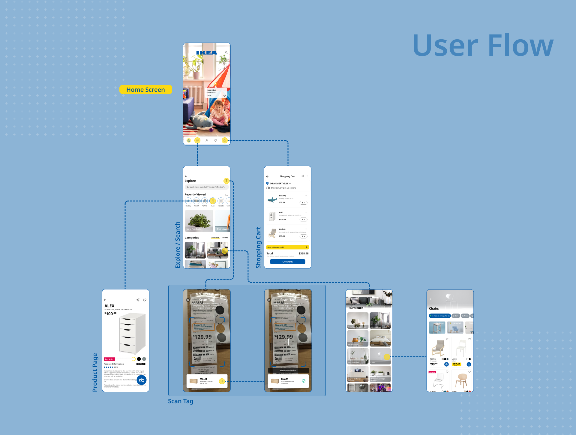
One of the biggest things I've learned was how to connect and integrate online and physical shopping elements. As most of IKEA's revenue comes from in-store shopping, there could be more digital integration with walking around the showroom to the warehouse for example. I find that most shoppers, including myself, will take photos of tags for products I am interested in to save for later. However, this means these photos will be saved on my phone's storage and possibly forgotten, whereas the IKEA app can easily scan the product I want and save to a list for viewing later, view all color options, or directly add to my cart. Not only does this make for a more organized and streamlined shopping experience for customers, this could also lead to increased sales and conversion rates for IKEA.
One small thing that I learned in this project was how to design based off of an existing design system - in other words, according to the challenge's prompt: “keeping their sleek and Scandinavian approach in mind”. I had learned to do this in my previous internships, however this time I did not have the official components on hand. Thankfully, IKEA's design system is very straightforward with its blue and yellow color scheme and single font, Noto Sans.
As this was a short project, I only focused on a few areas I saw immediately that could use improvement. If given more time, I would create the “Scan tag camera” screen and connect it to the “Add to list/Favorites” screens.
Another interaction I would consider is if a user wanted to add an out of stock item from the product page. Based on current interactions in the app, IKEA allows users to add out-of-stock items to their cart, but leads to later frustration when they find out they can't purchase it during checkout. I would add a feature that notifies users that the item is out of stock, and gives them an option to notify them again when it's back in-stock.
I noted that one user in a review mentioned that they had a hard time shopping at IKEA because of the Swedish naming system. I felt that it is its own challenge that can be explored well on its own that a short-term project tackling various features would not be able to accomplish fully. Hence why I added names of the products below in the search history section in the Explore page – it may help jog some memory for users. This is also why I added examples of search queries on the search bar rather than their original “what are you looking for?”, which I found rather vague.
Overall, I thought this was a fun short challenge for me to study an existing brand and do research on how I can make their app even better for their customers. This is the first project where I take a real existing brand's app (and one I use personally) to find ways to improve the experience.
