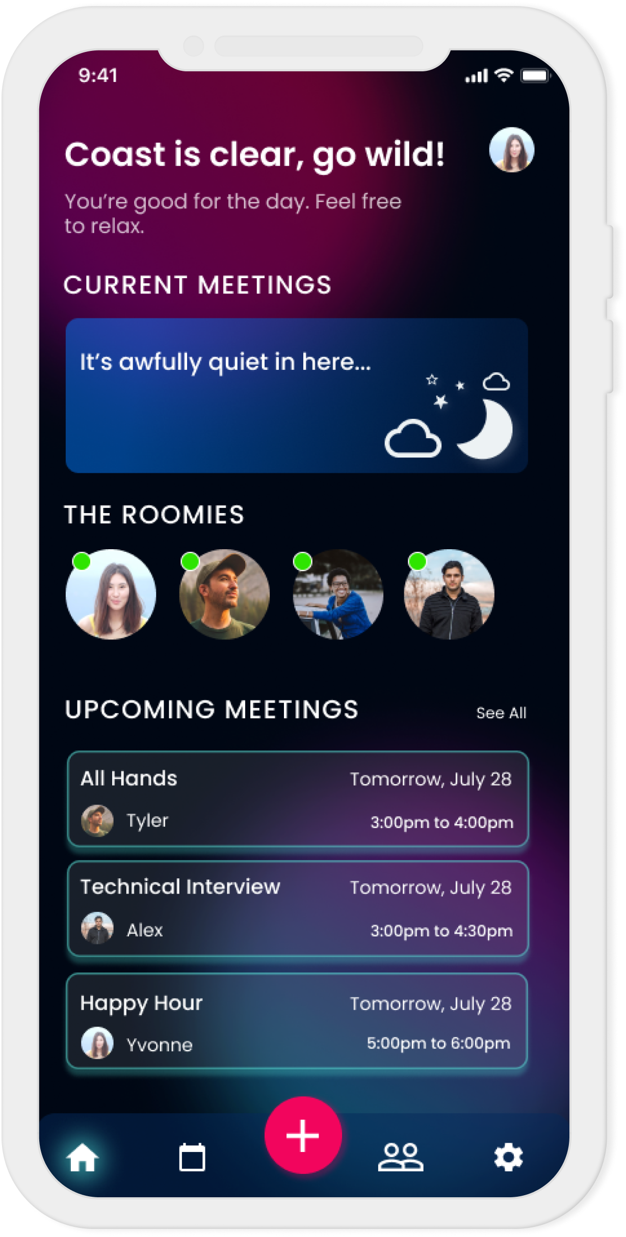
On-Air is an app that lets your household members know if you're in a meeting as soon as you turn on the live switch. It aims to reduce disturbance in your work meetings, classes, and just calls in general - giving you peace of mind.
Role: Research, Visual System, Product Design, Prototyping, Interaction
Tools: Figma, Notability
Length: Fall 2021 - Winter 2022

Since the beginning of the COVID-19 pandemic, many people have had to make the sudden switch over to work from home or distance learning. As a result, these people have to work around their housemates or their families who may either be in their own meetings, or unaware that they are causing a disturbance in the background. Most times, the workaround is just to let others know ahead of time, post signs outside your door, or simply send a message to the household group chat. However, these solutions are very manual and not always perfect, as people can often forget to notify their housemates – leaving them unaware.
I've come across some creative ideas that people have come up with to mitigate these disturbances, for example:
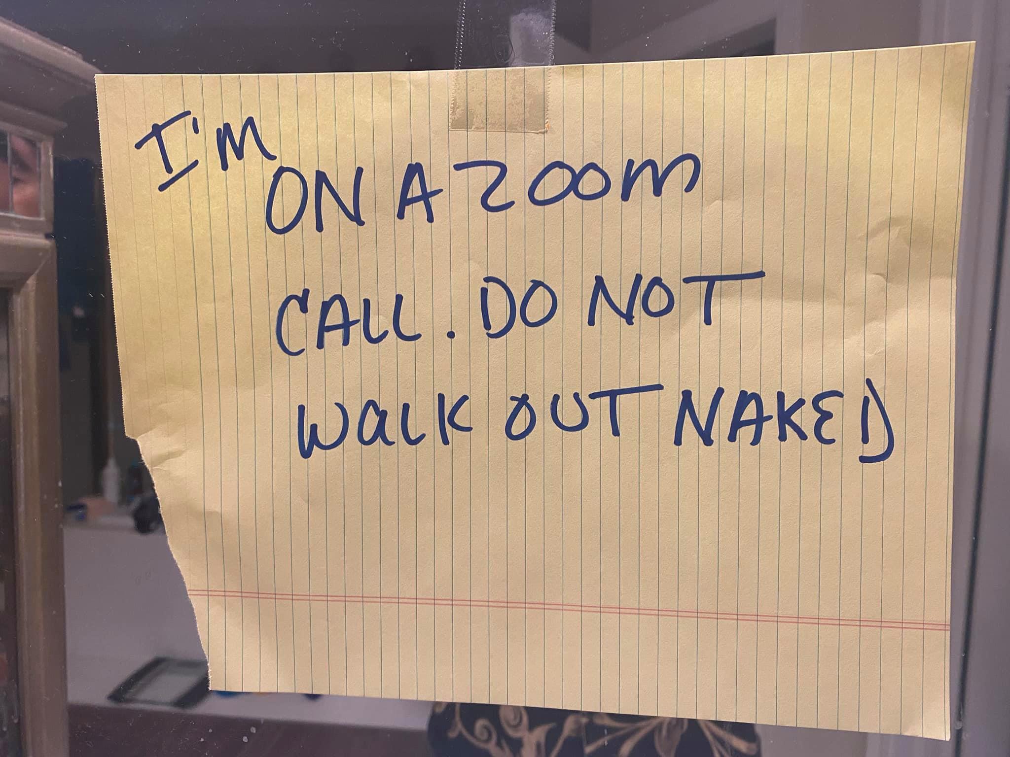
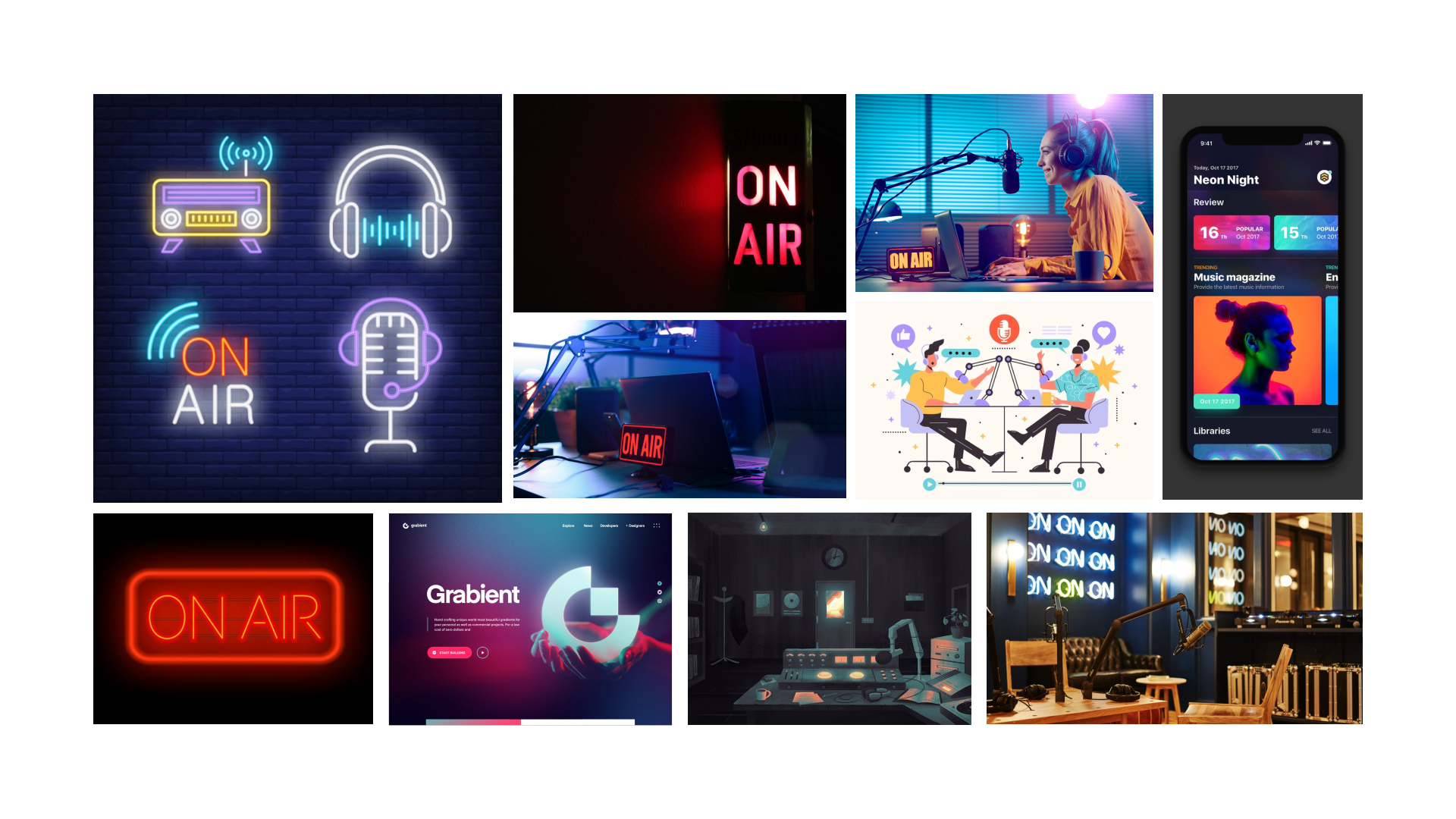
The classic radio “on air” light boxes are exactly where I got my inspiration for the theme of this idea – but I wanted to design one that is accessible to most people. While a physical device has its own charms, not everybody has the time or means to purchase or build an actual “On-Air” light box sign.
I want to solve this problem in a generalizable and consistent way, especially as working from home and remote learning become more and more widespread and normalized — even after the pandemic. This idea could also apply to users who do regular streaming on sites like Twitch, to those who do casual video/audio calling, and even to those who just don’t want to be disturbed.
Personally, I got most of my inspiration from living with my partner – who is in meetings often throughout the day as he's been working from home since the beginning of the pandemic. As a result, I've had moments where I suddenly forget that he's in a meeting and made loud distracting sounds (i.e. grinding coffee beans or using the ice dispenser, as our "home office" is in the same room as the kitchen).
For me, it would also be nice to have a visual way to see if my partner is currently in a meeting, check how long it’s supposed to run until, and see a schedule without having access to his calendar. Likewise, for him - it would give him a way to discreetly tell me that I'm being too loud without having to sneakily message me on his phone.
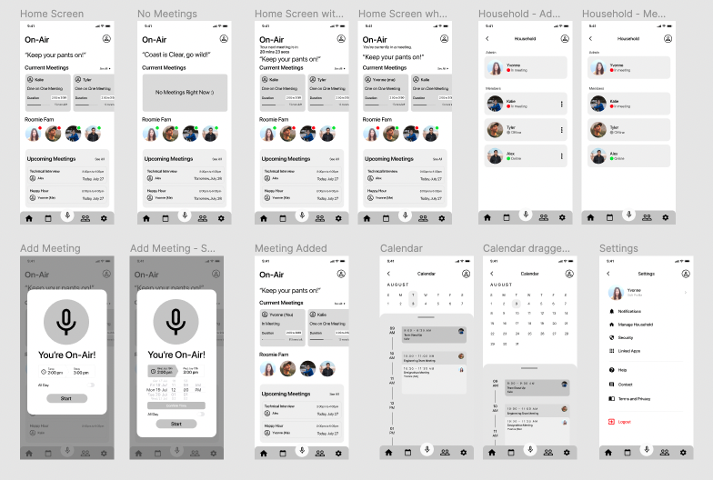
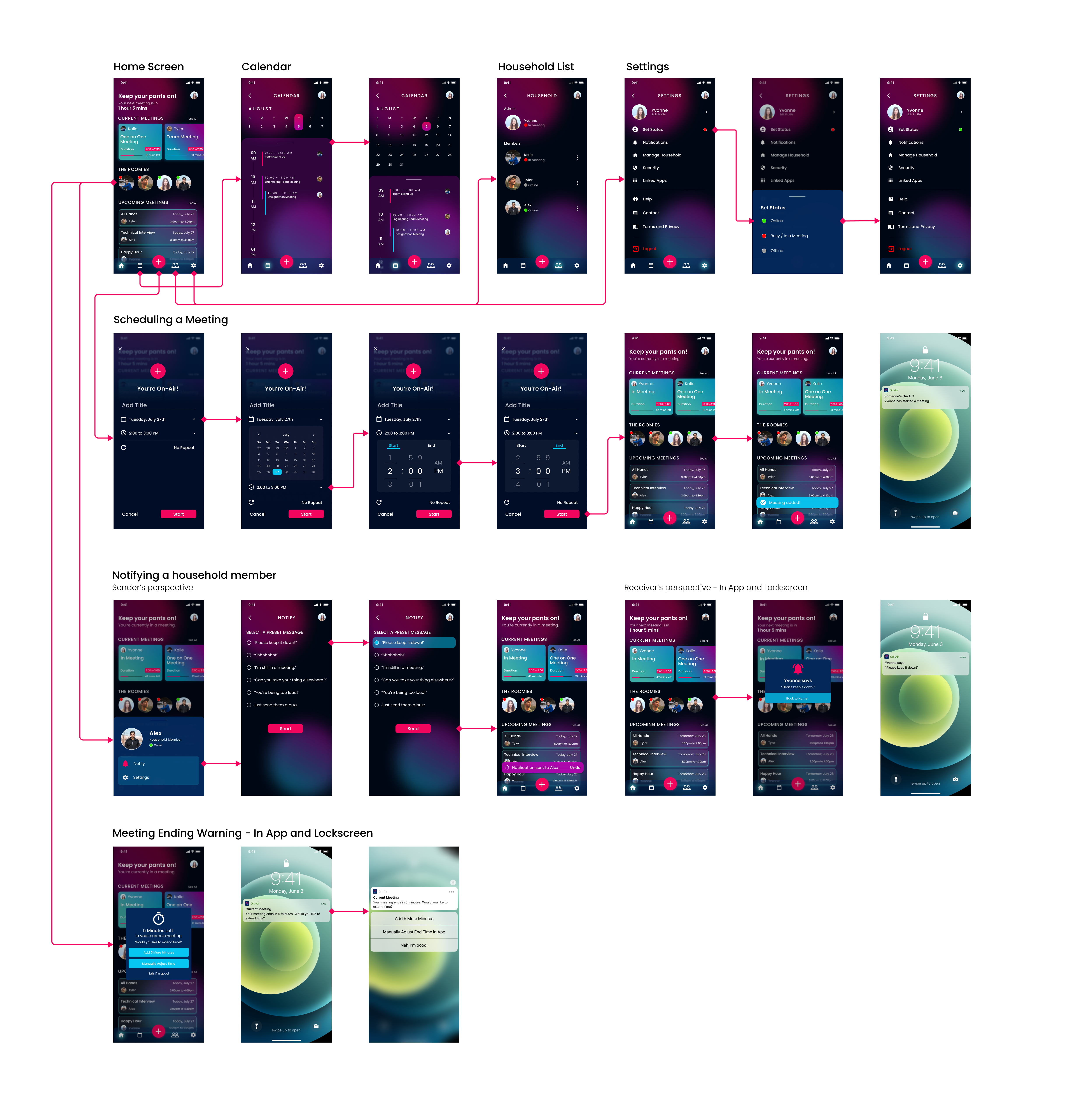
I started out by sketching a few screens to get an idea of what kind of flow and layout I wanted for the app. I then moved over to Figma to create a set of low-fidelity wireframes with some additional features and screens.

Initially, I debated whether or not to make dark mode the primary theme, as it’s usually an opt-in feature in apps that’s mainly utilized when viewing at night or in a dark room. However, I think it pairs well with the theme and mood that I'm trying to go for - radio studio inspired with neon aesthetics. I thought it was a good opportunity given that more and more apps these days are implementing dark mode as an optional feature or creating apps with a default dark theme – and it was a personal challenge for myself as I hadn’t designed with a dark theme before. However, I did recognize that it's strange for an app to utilize dark mode as a default especially if it's mainly going to be used during the daytime. Given that indoor lighting levels can vary for everyone’s home office space, having the option to switch between light and dark mode would be ideal.
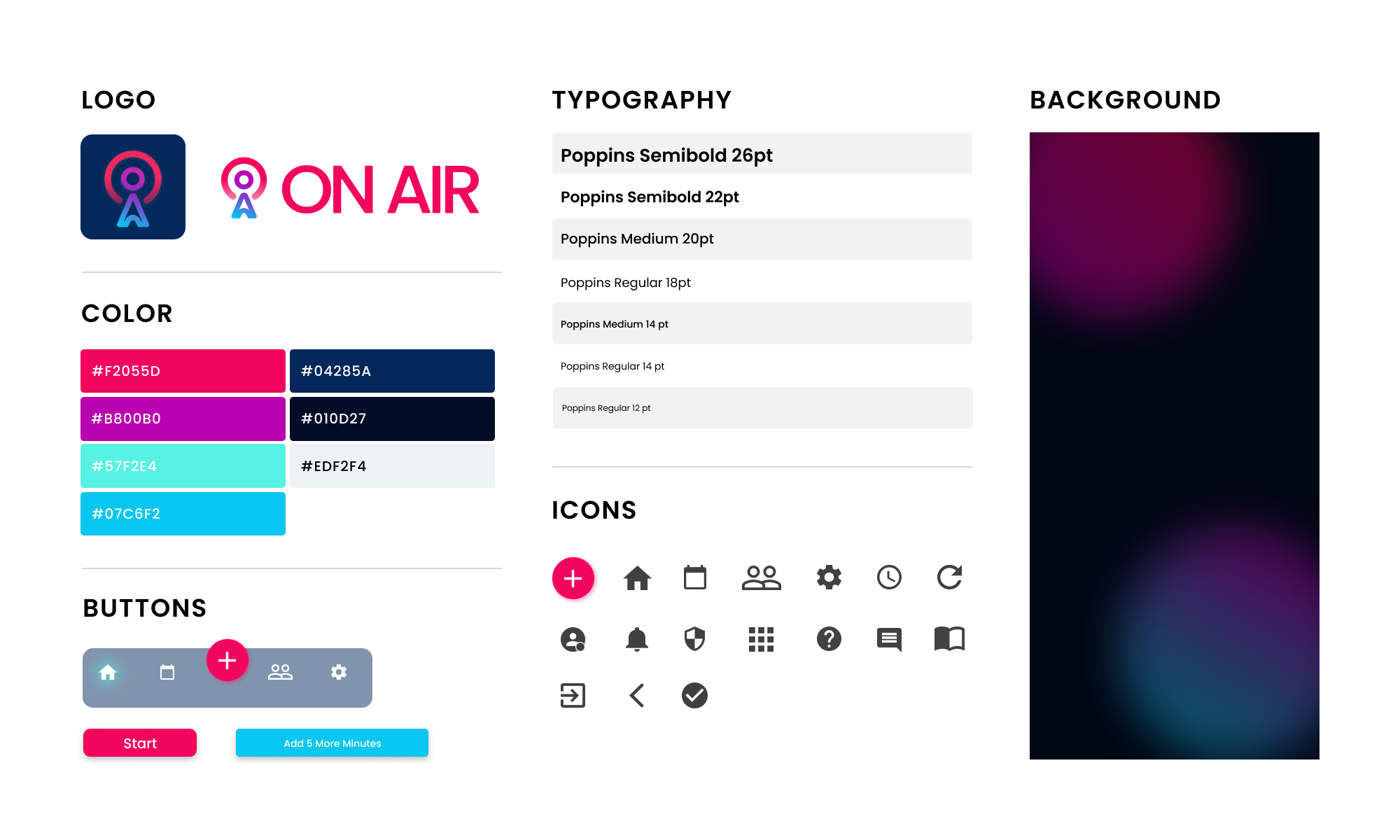
I envisioned a bright color scheme to contrast and pair well with the dark theme — neon colored signs were one of my inspirations. My first step into this exploration was creating a mood/inspiration board with neon signs and logos that incorporate this theme. I then took a color picker and picked out colors that I felt would work best, and had some similarity with common neon sign colors. One thing was for sure: I had the color red in mind to be a primary color for main features — for example, the going "on-air" button.
Another aspect of radio studio aesthetics that I drew inspiration from was the glass windows leading into the broadcasting studio rooms where professionals go live. I utilized this effect in certain features, like the navigation bar, calendar schedule, and the adding meetings feature.
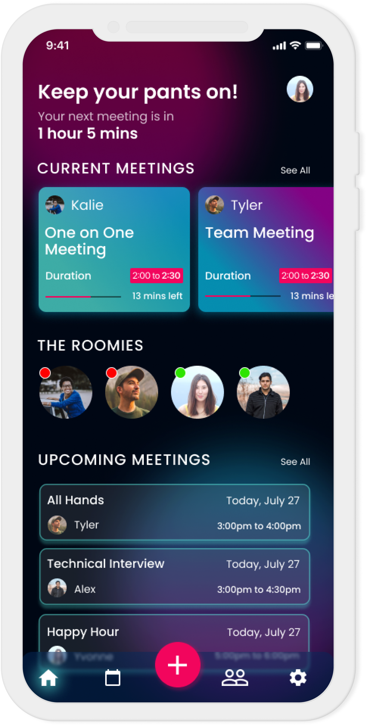
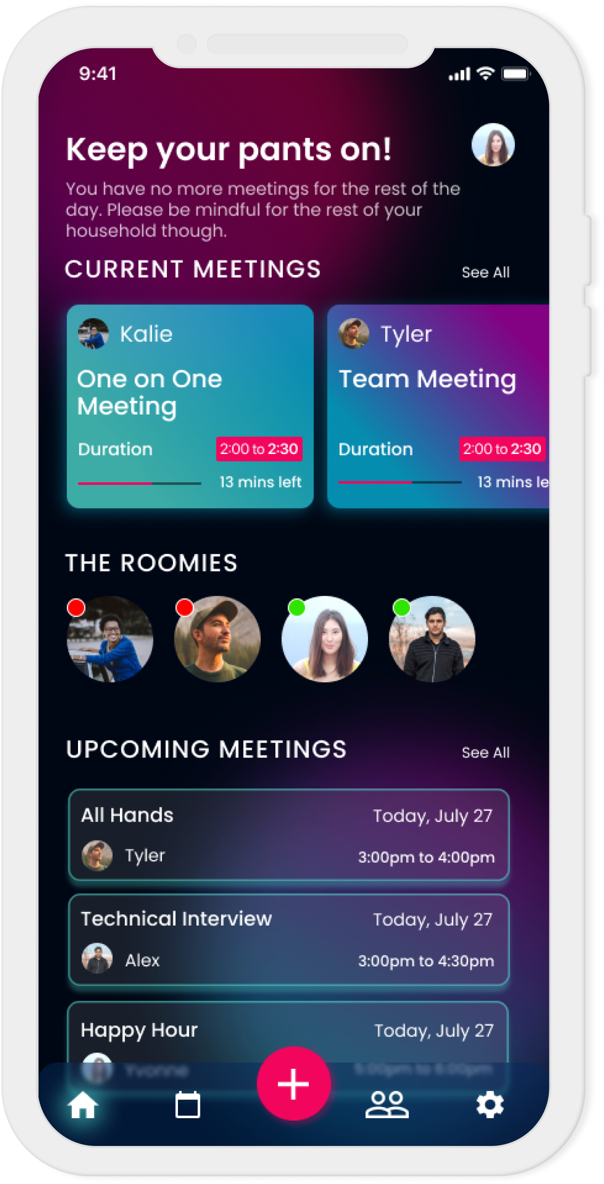
Press the + button on the navbar to quickly add a new meeting in case you end up in a last minute meeting, or want to schedule ahead.
See everyone's schedules for the day in a single combined view to plan ahead.
Send a quick notification to specific housemates if they are causing a disturbance.
Ability to extend your meeting time in case it goes over. Available as an in-app or device push notification.
Toggle your online status when you're done for the day, or configure your app settings.
As I mentioned previously, I thought this would be a good challenge for me to learn how to design in dark mode. Most apps are light by default — but that is slowly changing as more and more apps are providing dark mode as an option. I really do enjoy dark mode options personally, so I thought this would be a great opportunity to create my own. It was interesting having to navigate with negative space, rather than the positive space I'm used to working in. My biggest challenge was how to make colors stand out without making them too overwhelming — especially with the neon-ish palette I chose. The question I wanted to answer was: how do I strike a balance with the usage of (bright) colors amongst the dark background?
I normally don't choose bright neon colors as a theme, or in general, but I felt this would also be a good way for me to see how well I can work with a brighter color palette. In retrospect, I could have chosen a better set of colors to work with that's more subdued yet still neon-like and still get the theme across. However, I don't think it looks too bad as I was basing these colors from neon signs.
I'm still learning and adjusting to using Figma as my default program after using Sketch throughout my internship — and studying all three UI programs simultaneously during my bootcamp (Sketch, Adobe XD, and Figma). I previously knew how to prototype in Adobe XD and somewhat in Figma, but it was a challenge to not be able to really make seamless animations as easily as I could in XD. As a result of this project, I learned how to time the animations so that it feels more fluid and timely when they go off, and organize my components better so Figma can properly animate the transitions. Also, I learned how to work with different styles of animations, such as slide-ins, auto-animation, delays, dragging, etc. I still have a ways to go to fully understand how to use the many animation features, but this project gave me a great insight into it.
As I was wrapping up my prototypes, I realized it could be useful to be able to send notifications to more than one person or the entire household at once, instead of just a single person currently. There could be scenarios where the user hears noises outside but isn’t sure who is causing the disturbances. For these situations, I would consider building a feature to broadcast a message to multiple people.
Despite how much I researched and experimented with various neon and bright colors – I don’t feel like I am fully satisfied with the final palette. To be fair, neon colors are not my forte, so it was difficult to select a set of colors that work well together. I wish I had set aside more time to consider more sets of colors, rather than settling on a palette that I put together relatively quickly. Accessibility-wise, I would have also considered alternative color palettes or making sure the colors I chose are inclusive for those with color blindness.
It would make things much more streamlined for users to be able to connect their calendar apps and have the schedules automatically sync into the On Air app, rather than having to manually add events into the app itself. I had considered this feature in my early ideations, but if I had to revisit this project again, I would absolutely look into building first-class support for this.
